
Have you ever walked into a large building and felt completely lost? Poor wayfinding frustrates visitors, wastes time, and creates unnecessary stress. Consequently, designing an effective directional sign system is one of the smartest investments you can make for your facility. Directional signs, when properly designed and placed, can significantly improve customer traffic patterns.
A well-planned wayfinding system does more than point people in the right direction. It creates confidence, improves the visitor experience, and reflects positively on your organization. Moreover, it reduces the burden on your staff, who would otherwise spend time giving directions.
Understanding the Foundation of Wayfinding
Wayfinding is the process of using visual cues to help people navigate physical spaces. It’s like creating a conversation between your building and its visitors, where every directional sign becomes part of the interaction.
When a building is signed improperly, it means more than just frustration. Aside from negative first impressions, it also means late arrivals and missed appointments due to inadequate signage. There are also emergency situations where clear directional signs can be critical for safety.
We counsel our clients such that their wayfinding system works intuitively. Visitors shouldn’t need to study a map or ask for help at every turn. Instead, they should move through their space with ease and confidence.
The Essential Types of Directional Signs
In creating an effective system, it’s important to understand the different sign types and their purposes. Each plays a specific role in guiding visitors through your facility quickly and effectively.
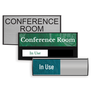
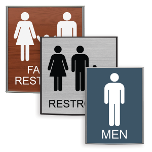
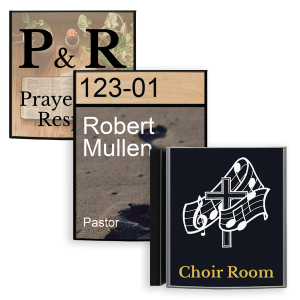
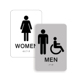
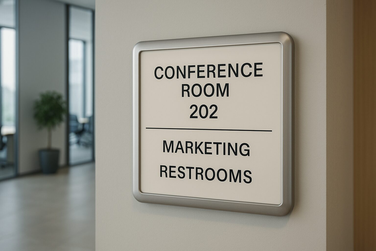
Identification signs mark specific locations. Vista System refers to these as office signs or door signs. These signs typically contain room numbers, room names, department names, and employee names and titles.
Directory signs provide overview information. These signs typically appear at building entrances and near elevator banks on each floor. Lobby directories, floor directories, and tenant listings help visitors plan their route before they start walking. Directory signs are the first signs one encounters upon entering your building.
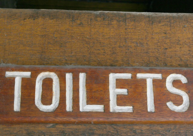
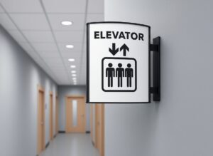
Suspended and projecting signs fill in the gaps. They support transitions, intersections, stairwells, and secondary corridors. These are used throughout the building in long corridors, signaling stairwells, exits, and restrooms, among others. These complement all the other signage, especially directory signs. Without them, even the best directory fails.
Directional signs with arrows guide people along their journey. A directional arrow sign is typically found in long corridors, hallway intersections, or in locations where the destination may not be easy to find. Corridor signs, overhead markers, and wall-mounted directional arrow signs guide visitors to the next destination.
Pylon and monument signs handle exterior wayfinding. These are larger signs, specifically designed to direct your clients or visitors to the correct building. They help visitors navigate campus environments or business parks, allowing them to find the right building entrance. Custom directional signs for outdoor use must withstand weather while maintaining visibility. They are typically fabricated differently from interior signage.
Regulatory signs ensure compliance and safety. ADA-compliant room identification and exit signage fall into this essential category. These signs have strict guidelines on both fabrication and installation. To illustrate that point, here is an example of ADA Braille Sign Installation Guidelines for reference.
Creating a Clear Information Hierarchy
When properly designed, effective wayfinding systems follow a clear hierarchy. They typically start with general information and progressively add more specific location details as one moves further into the building. Building entrances, elevator lobbies, hallway intersections, and stairwell exits all require careful attention when signing a building. Consequently, strategically placing your directional signs at these locations is critical.
By carefully layering your information, lobby directory signs provide the main introduction. Then directional signs in hallways take over, providing turn-by-turn guidance. Finally, room identification signs at destinations confirm arrival and complete the loop.
Designing Directional Signs for Consistency and Clarity
Visual consistency ties your entire system together. Consequently, establish clear standards for fonts, colors, materials, and sizing before you begin. This creates a cohesive look that visitors instinctively recognize and trust.
A directional arrow sign design should be highly intuitive and immediately understandable. Arrows must be legible and unambiguous. Colors should provide adequate contrast for easy reading, and fonts must be legible from appropriate viewing distances. General rules for legibility suggest a 1” character height for every 10’ of distance.
Balancing aesthetics with functionality can be challenging for designers. Great-looking signs that people can’t read quickly have little to no value.
Common Mistakes That Undermine Wayfinding
Information overload on individual signs confuses rather than helps. Each sign should communicate one clear message. If you’re trying to say too much, consider using multiple signs instead.
Inconsistent terminology creates confusion. For example, don’t call the same location “Suite 200” on one sign and “Second Floor North” on another. Best practices suggest picking one naming convention and sticking with it throughout your system. Having a uniform sign schedule or sign codes will help eliminate this problem.
Poor placement can render even the best signs useless. Directional signs mounted too high or too low, or obscured by other elements, fail to serve their purpose. Similarly, signs placed after decision points rather than before them leave visitors guessing.
Neglecting your intended customer traffic patterns results in coverage gaps. Walk through your building as a first-time visitor would, and use your intuition to determine where a sign might be needed. Most sign companies can help, while consulting firms specializing in wayfinding may be the optimal choice for new construction or large projects.
Implementing Your Wayfinding System
To implement your wayfinding system, start with a thorough audit of your current space. Identify confusing areas, missing signage, and opportunities for improvement. Map out desired customer traffic patterns. Understanding these patterns helps you place signs where they’re needed most.
Next, test your proposed system before ordering your signs. Temporary signs or even paper printouts can reveal problems you didn’t anticipate. This includes location, visibility, legibility as well as effectively creating the desired traffic patterns. Ask colleagues, friends or family members unfamiliar with your building to navigate using your new signage plan.
Finally, plan for flexibility because things change. Departments move, tenants come and go, and building configurations evolve. Choose modular sign systems that allow for easy updates without replacing entire signs. Modular designs and interchangeable inserts offer practical solutions. They also provide a common look and feel throughout the building.
Directional Signs and Moving Forward with Confidence
To summarize, creating an effective wayfinding system requires thoughtful planning and attention to detail. The investment pays dividends through improved visitor experiences and reduced operational friction. It also saves an exponential amount of money for ongoing maintenance.
Your building’s wayfinding system affects how people experience your company or organization. Whether you’re planning a complete overhaul or addressing specific problem areas, a strategic approach to custom directional signs mitigates that problem.
Ready to evaluate your facility’s wayfinding needs? A professional signage consultation can help you design a system that works seamlessly for your unique space and user requirements.