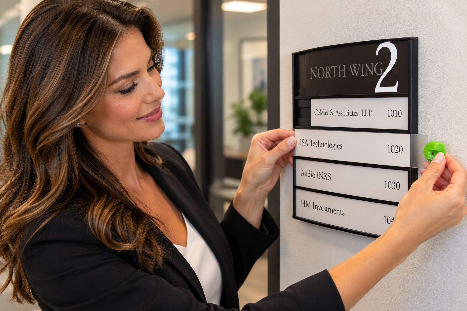
Posted on

Vista System Buyer’s Guide: Families, Sizing, and ADA Specs

Vista System is a modular aluminum sign frame line built around changeable inserts, and in the United States it is sold through authorized resellers Vista calls Ambassadors. Buying it well comes down to four decisions: the frame family, the insert size, how ADA content is handled, and who you order from. This guide walks through each one.

At Sign-Frame we have sold and specified Vista products for more than 21 years, from a single office door to campus-wide sign schedules. If you are still deciding whether changeable signage fits your building at all, start with how changeable Vista signage compares with traditional signs. This post assumes you have already decided and want to get the order right the first time.

Who Makes Vista System Signs and Where Do You Buy Them?

Vista System LLC, based in Sarasota, Florida, designs and manufactures the frames, but it does not sell directly to end users. Facility teams, contractors, and architects buy through Vista Ambassadors, which are resellers trained and authorized on the full product line.

Sign-Frame is a Vista Ambassador. Our online Vista System store carries the most popular sizes, and anything in the full Vista System catalog (PDF) can be ordered through a quote, including families and custom sizes you will not find listed online. We ship across North America, hold a GSA contract for government buyers, and take Canadian orders by phone or email.

That distinction matters on a project. A reseller who knows the entire catalog can solve an odd wall, a long room name, or a tricky ADA condition with an existing part instead of a custom fabrication with a long wait.

Which Vista System Family Should You Choose?

Choose the family by the look you want and the insert you plan to use. Curved Vista and Nova frames suit paper inserts printed in-house, flat Square frames give a clean modern profile, frameless Sharp frames are made for interiors, and VRS frames fit specs that call for square corners and metal panels.

Vista describes its classic family as the first curved modular sign system, and it remains the workhorse for corridors and offices. Vista also makes illuminated (Light), fabric, art, expandable, display, and brochure holder families. You can browse the complete list of Vista product families on the manufacturer’s site, and we can quote any of them.

FamilyProfile and lookInserts it takesWhere it is usedBest fit
Vista (classic)Curved face, portrait or landscape, plastic or metal end caps, silver or black anodized (custom colors available)Paper and most flexible materialsIndoor and outdoor setsCorridors, offices, and campus standards with frequent changes
Vista NovaGentle curve with wide paneled sidesPaper, engraved, photopolymer, vinyl, tactileIndoor and outdoorLobbies, premium office floors, directories
Vista SquareFlat profile, grey or black end caps, optional floating mountFlexible and rigid insertsMostly indoor; projecting versions handle outdoorModern interiors, libraries, menu boards
Vista SharpFrameless look, 2- or 4-sided aluminum extrusionPaper or rigid panels such as DibondDesigned for indoor useReception, executive suites, glass-heavy interiors
VRSSquare-cornered architectural aluminum, silver or black anodizedMetal or Dibond face panels; slider and channel optionsRoom ID and wayfindingArchitect specs that call for a squared-off frame

One family per building is the safest default. You can mix families on purpose, such as Sharp in the reception area and classic Vista in the corridors, but decide that in the design phase. Mixing by accident, one order at a time, is how a building ends up looking like it was signed by three different vendors.
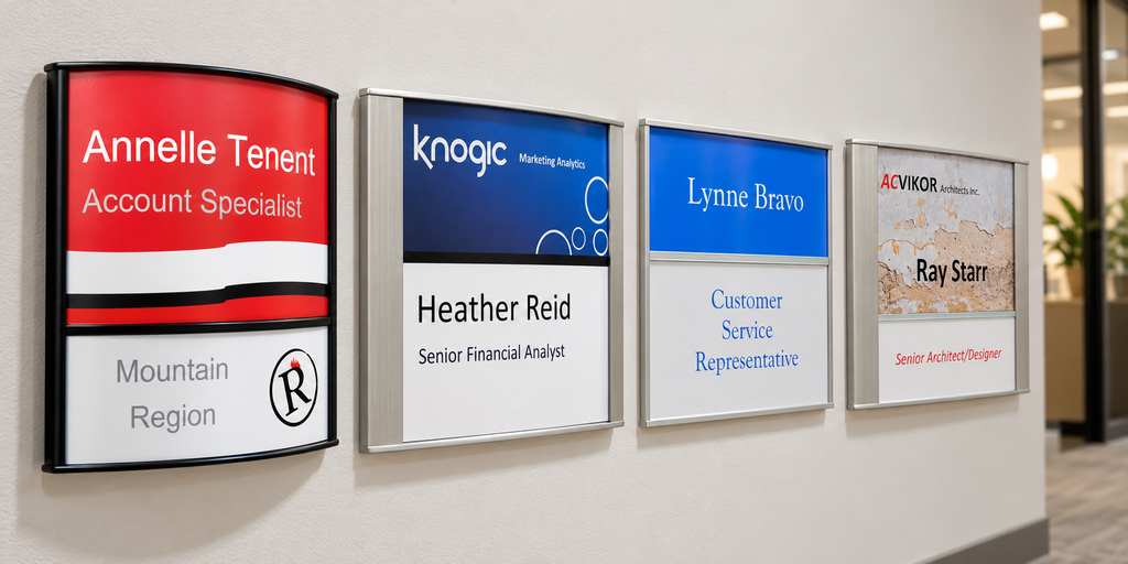
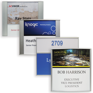
Vista System sign frame families compared, curved, Nova, Square, and Sharp profiles

How Do You Size Vista Sign Frames Correctly?

Size from the insert, not the frame. Every Vista profile has three widths: the overall sign, the insert, and the visible area, and the visible area is always a little smaller because the frame covers the insert’s edges.

Here is a real example from Vista’s own size table: the V-LETTER profile takes an 8.5-inch-wide insert, but about 8.23 inches of it is visible. Designers who run text or a colored band right to the edge of the file lose it under the frame. Keep a margin on every template, and print a test insert before you print a hundred.

The second sizing mistake is planning for the average name instead of the longest one. A frame that fits a short last name will not fit a long title like Director of Environmental Health and Safety at a readable size. Pull the longest room name and title in the building before you pick a width. Our Vista sizing chart lists the standard heights and widths we stock online.

How Do ADA Signs Work With Changeable Vista System Inserts?

Put the permanent information on a tactile ADA lens and the changeable information on a paper insert. Under the 2010 ADA Standards, room numbers and permanent room names need raised characters and Grade 2 braille, while occupant names and titles are exempt from both visual and tactile requirements.

The U.S. Access Board’s guide to ADA sign requirements spells this out, and it is the reason changeable ADA signs work. Our Vista ADA office sign frames use a 1/16-inch acrylic lens with surface-applied tactile letters and friction-fit braille, set into the aluminum frame. Clear ADA lenses are designed to sit over a paper insert you print yourself. Colored and wood-look lenses carry everything on the lens and do not need one.

When someone moves offices, a staff member removes the lens with a suction cup, swaps the paper insert, and puts the lens back. The room number never changes, so the tactile part never needs replacing.

Placement still has to follow the standard. Tactile characters must sit between 48 inches above the floor, measured to the baseline of the lowest tactile line, and 60 inches, measured to the baseline of the highest. The sign goes on the latch side of the door, with an 18-by-18-inch clear floor space centered on it and outside the door’s swing. California projects add Title 24 rules, covered in our guide to California Title 24 sign requirements, and we offer California braille on request.

Vista System Selection Matrix

Match the situation to a family, an insert approach, and an ordering path. This matrix reflects how we typically spec Vista System projects for healthcare, university, and commercial buildings.

SituationRecommended familyInsert approachHow to order
Hospital or clinic corridors with frequent staff changesVista classic, one size per sign typeClear ADA lens over an in-house printed paper insertQuote with a sign schedule
University offices spread across many buildingsVista or Nova, one family campus-widePaper inserts from a shared templateQuote for the rollout, online for add-ons
Lobby directory that changes with tenantsVista or Nova directoryOne strip insert per tenant or departmentOnline for standard sizes, quote for custom
Reception area or executive floorSharp or NovaRigid printed panel or paperQuote
Contractor bid with an architect’s specThe family named in the specAs listed in the submittalQuote with submittals and samples
A few door signs needed this weekVista classic quick-ship sizesPaperOnline; ships next business day if ordered before noon Eastern
Exterior or covered outdoor locationsVista outdoor setsWeather-resistant lens with vinyl graphics, no paperQuote

Directories deserve a note of their own. A tenant directory changes more than any other sign in a building, so pick a profile with individual strips rather than one large panel. Our Vista directory sign frames are built that way, which means one tenant change is one strip, not a reprint of the whole board.

What Should a Vista System Spec or Submittal Include?

A complete spec names the family, profile and size code, finish, end caps, mounting method, insert material, and the ADA lens details for every sign type. Leave any of those out and the bid prices will not be comparable.

The detail that catches contractors most often is finish. Our quick-ship Vista frames come only in brushed silver with grey or black plastic end caps. If the spec calls for black anodized frames or metal end caps, quick ship is off the table, so know that before you promise an owner a date.

Mounting is the other one. Vista frames can go up with screws, double-sided tape, or silicone, and the right choice depends on the wall. Tape works on smooth painted drywall, but it is a poor bet on textured surfaces, glass with film, or anywhere the sign might be pulled. Call it out in the submittal so the installer is not guessing on site.

We prepare sign schedules, proofs, samples, and submittals for medium and large projects. For owners who want the program to stay consistent after turnover, pair the spec with a written standard; our post on building a cohesive signage standard covers what that document should include.

Vista System Lead Times and Ordering Paths

At Sign-Frame, quick-ship frames ship the next business day, standard Vista frames take about 10 days, and custom ADA inserts take 10 to 15 business days. That is far shorter than the three-to-six-month timelines many project buyers run into with fully custom sign fabrication.

Online orders default to ground shipping, which can take up to five business days depending on location. Expedited shipping is available by phone. Every ADA sign and printed insert is proofed for your approval before production, so build a day or two for review into your schedule.

Changing a paper insert behind a clear Vista System ADA lens
Updating a Vista System Office Sign


Key Takeaways

Frequently Asked Questions

Can you buy Vista System signs directly from Vista?

No. Vista System sells through its network of Ambassadors, which are authorized resellers trained on the product line, rather than directly to end users. Sign-Frame is a Vista Ambassador, so we can supply anything in the current Vista catalog, including sizes and families not listed in our online store. Popular sizes can be ordered online, and larger projects go through a quote.

What is the difference between Vista and Vista Nova sign frames?

Both are curved Vista sign frames that take changeable inserts. The classic Vista profile has a curved face capped at each end, while Nova pairs a gentler curve with wide paneled sides that frame the insert. Classic Vista comes in more sizes, with its largest profile about 48 inches wide. Nova reads as slightly more upscale and suits lobbies and executive floors.

Can ADA signs use changeable paper inserts?

Yes, as long as the tactile content stays permanent. Room numbers and permanent room names need raised characters and Grade 2 braille, but occupant names and titles are exempt under the 2010 ADA Standards. A clear ADA lens carries the tactile content, and a printed paper insert behind it shows the name, so staff can update it in minutes without replacing the sign.

How long does it take to get Vista System signs?

At Sign-Frame, quick-ship Vista frames ship the next business day when ordered before noon Eastern. Standard Vista frames take about 10 days, and custom ADA inserts take 10 to 15 business days. Ground shipping adds up to five business days depending on location, and expedited shipping is available by phone. Large projects are scheduled around your sign schedule and approvals.

Do Vista sign frames fit standard letter-size paper?

Yes. Vista makes letter-size profiles in several families, including the classic V-LETTER, the Nova VN-Letter, and the Square F-Letter, each built for an 8.5-inch-wide insert. Plan for a slightly smaller visible area because the frame covers the edges. On the V-LETTER, about 8.23 inches of the insert shows, so keep text and color bands away from the edges.

Can government agencies buy Vista System signs through GSA?

Yes. Sign-Frame holds a GSA contract, which gives federal buyers a compliant way to purchase Vista System products. Check GSA Advantage for the items and pricing currently listed, or request a quote and we will confirm which products and sizes are on the contract before you order. We also handle sign schedules and submittals for government projects.

Ready to Spec Your Vista System Project?

The Vista System rewards buyers who make a few decisions up front: one family, the right insert size, a clear plan for ADA content, and a reseller who knows the whole catalog. Get those right and the signs stay current for years with nothing more than a printer and a suction cup.

Send us your floor plans or sign schedule through our request a quote form, or call 1-866-299-9933 to talk through families, sizes, and ADA details with someone who has specified Vista for more than two decades.
Posted on

Office Signs: Types, ADA Rules, and How to Plan Them

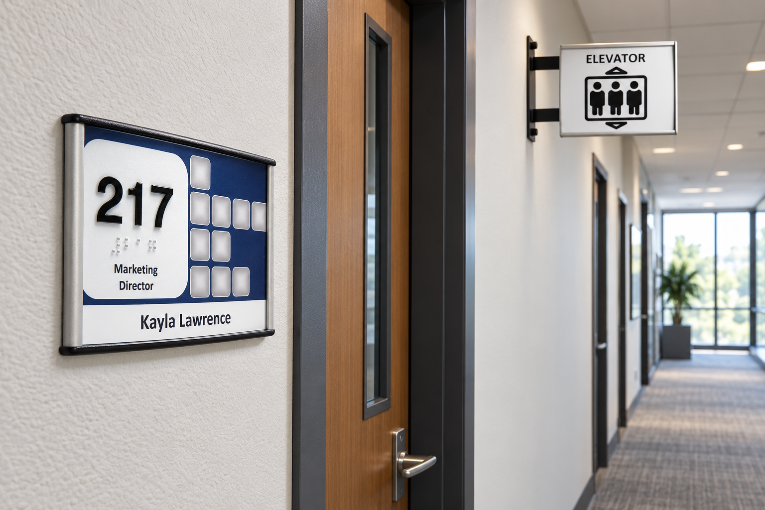
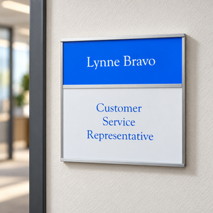
Office signs with changeable inserts mounted beside doors in a commercial office hallway

Office signs are the room identification, door, cubicle, directory, and directional signs that help people find their way through a workplace. A complete office sign plan covers which sign goes where, which signs must meet ADA tactile rules, and how you will update names as people move. Get those three decisions right and everything else falls into place.

After more than 21 years of specifying and shipping office signs for companies, schools, medical offices, and government agencies, we have watched the same mistakes repeat. Most of them happen before a single sign is ordered. This guide walks through the sign types, the ADA rules that apply to each, and a simple way to plan the whole system so it still works five years from now.

What Types of Office Signs Does a Building Need?

Most office buildings need six types of office signs: room identification signs, name or door signs, cubicle signs, directory signs, directional signs, and restroom signs. Each one answers a different question for the visitor, and each one carries different ADA obligations.

Think about how someone actually moves through your space. The lobby directory tells them which floor or wing to head for. Directional signs at hallway intersections keep them moving. The room identification sign at the door confirms they have arrived, and the name sign tells them who sits inside. In open work areas, cubicle signs do the same job for workstations that door signs do for private offices.

Conference rooms deserve their own mention. A good conference room sign pairs a permanent room name with a sliding “in use” or “available” indicator, which cuts down on people knocking mid-meeting. Our conference room signs are built around that exact setup.

Office signs with changeable inserts mounted on the latch side of office doors


Office Sign Planning Matrix: Which Signs Need ADA Features?

Only signs that identify permanent rooms and spaces need raised characters and braille. Directories, occupant names, and temporary signs are exempt, and directional signs only need to meet the visual requirements. Use the matrix below to sort every sign in your building before you request pricing.

Sign type Where it goes Tactile and braille required? How often it changes Best format
Room identification (office, room number) Wall beside the door, latch side Yes, for permanent rooms Rarely Tactile ADA panel in a frame
Occupant name sign Below or beside the room ID No, occupant names are exempt Often Changeable paper insert
Combined door sign Wall beside the door, latch side Yes, on the room ID portion Name portion often ADA room number plus changeable name insert
Cubicle sign Panel edge or cubicle entry Generally no Often Changeable insert frame
Building directory Lobby, elevator landings No, directories are exempt Often Large changeable insert frame
Directional sign Hallway intersections Visual rules only Occasionally Wall or flag mount frame
Conference room sign Wall beside the door Yes, on the room name Rarely, slider changes daily Tactile panel plus in-use slider
Restroom sign Wall beside the door, latch side Yes Rarely Tactile ADA sign with pictogram

These categories come straight from the scoping rules in the 2010 ADA Standards for Accessible Design. The practical takeaway is simple. You can split most office door signs into a permanent ADA section and a changeable name section, and only the permanent section has to be tactile.

ADA Rules for Office Signs: Height, Location, and Braille

ADA office signs must be mounted so the baseline of the lowest tactile character sits at least 48 inches above the finished floor and the baseline of the highest tactile character sits no more than 60 inches above it. The sign goes on the wall on the latch side of the door, with an 18 by 18 inch clear floor space centered on the tactile characters.

The U.S. Access Board’s guide to ADA sign requirements spells out the rest. Raised characters must be between 5/8 inch and 2 inches tall. Grade 2 braille goes below the text, separated by at least 3/8 inch. The characters need a non-glare finish and strong light-on-dark or dark-on-light contrast. For double doors, the sign goes beside the inactive leaf, or to the right of the doors when both leaves are active.

Here is the insider tip most installers miss. The 48 to 60 inch range is measured to the baseline of the characters, not to the center or bottom edge of the sign. We regularly see signs hung “at 60 inches” by the bottom edge, which pushes the top line of text out of range. Our ADA braille sign installation guidelines show the measurement step by step.

If your building is in California, Title 24 adds its own requirements on top of the federal rules. Read our California Title 24 ADA sign requirements before you finalize a California project.

How to Plan an Office Sign System That Lasts

A lasting office sign system uses one frame style, two or three standard sizes, and changeable inserts for anything that names a person or a team. That combination keeps the building looking consistent while making updates fast and cheap.

Start with a sign schedule. Walk the floor plan room by room and record the room number, room name, sign type, and whether it needs tactile features. Facilities managers who skip this step usually end up with mismatched signs ordered in three separate batches.

Next, standardize your sizes. When all your office door signs use the same insert size, you can print replacement names in house and swap any insert into any frame. This is where a modular system like Vista System pays off, because a 6 by 6 inch frame on the third floor takes the same insert as one in the lobby.

Finally, plan for change. Office signs with changeable inserts let your team update a name in a couple of minutes without calling a sign shop. We break down the long-term savings in our post on office signs that save you money and the up-front numbers in our guide to typical office sign prices and cost drivers.

The Most Common Office Sign Mistakes We See

The most common office sign mistake is putting the occupant’s name into the tactile ADA panel. Names change constantly, and every change then requires a new custom tactile sign. Keep the room number or room name tactile and put the person’s name on a changeable insert below it.

The second mistake is mounting the sign on the door itself. Unless the door has a closer and swings away from the reader, a sign on the door can swing out of reach. The wall on the latch side is almost always the safer spot.

The third mistake is ordering signs one department at a time. Six months later, nothing matches. Order all your office signs from a single sign schedule, even if you install in phases, and keep a few spare frames on hand for new offices.

ADA office sign with braille room number and changeable name insert


Choosing Office Signs for Your Building

The right office signs match your frame style across every sign type, meet ADA rules where they apply, and let your own team handle everyday updates. Sign-Frame offers matching office signs, cubicle signs, directories, and ADA office sign frames with tactile room numbers in the same profiles, so your building reads as one system.

Key Takeaways

  • Sort every sign into permanent room ID, occupant name, directory, or directional before you price anything.
  • Only permanent room identification needs raised characters and Grade 2 braille. Names and directories are exempt.
  • Mount tactile text between 48 and 60 inches, measured to the character baselines, on the latch side wall.
  • Standardize your office signs on one frame style and a few insert sizes so any name can be printed and swapped in minutes.

Frequently Asked Questions

What size should an office door sign be?

Most office door signs fall between 5 by 5 inches and 8 by 8 inches, with 6 by 6 inches the most common choice for a room number and name together. If the sign includes tactile text, the raised characters must be 5/8 inch to 2 inches tall, so leave room for braille below them. Pick one size and use it on every door.

Do office signs need braille?

Office signs that identify a permanent room, such as a room number or a room name like Conference Room B, need raised characters and Grade 2 braille under the 2010 ADA Standards. Signs that show only an occupant’s name, building directories, and temporary signs are exempt. Many buildings combine a tactile room number with a changeable name insert.

How high should an office sign be mounted?

An ADA office sign should be mounted so the baseline of the lowest tactile character is at least 48 inches above the finished floor and the baseline of the highest tactile character is no more than 60 inches above it. Measure to the character baselines, not the edges of the sign plate.

Which side of the door does an office sign go on?

An office sign goes on the wall on the latch side of the door, the side with the handle. The ADA requires an 18 by 18 inch clear floor space centered on the tactile characters, outside the door’s swing. For double doors with one active leaf, mount the sign beside the inactive leaf.

What is the difference between a room ID sign and an office name sign?

A room ID sign identifies a permanent space, such as Room 214 or Conference Room B, and must include raised characters and Grade 2 braille. An office name sign shows who works in the room and is exempt from tactile rules. Putting both in one frame keeps the ADA portion permanent while names change in minutes.

Do cubicle signs need to be ADA compliant?

Cubicle signs generally do not need raised characters or braille, because workstations are not permanent rooms and occupant names are exempt under the 2010 ADA Standards. If a cubicle sign identifies a permanent space, such as a reception or mail area, confirm the requirement with your local code official. Clear, high-contrast text still helps every visitor.

Get Your Office Sign Plan Started

Have a floor plan or a sign schedule in hand? Request a quote and we will match every room to the right office sign, ADA features included. Prefer to talk it through? Call us at 1-866-299-9933 and speak with someone who has been doing this for over two decades.

Posted on

Office Door Signs: How to Choose the Right System for Your Business

Sign on a dark wall reading 'CRY ROOM' with Braille beneath the text, mounted to the wall near a wooden surface.
office-door-signs
Vista Office Door Signs

Walk through any professional building, and the office door signs tell you a lot — not just about who sits where, but about how the organization operates.

Mismatched signs, blank frames, or handwritten labels on tape signal a business that hasn’t thought through its signage. A clean, consistent system of office door signs signals professionalism, organization, and attention to detail. It’s a small thing that visitors and clients notice immediately.

But here’s what most businesses don’t think about when buying office door signs: the purchase isn’t just about today. It’s about every employee change, every room rename, and every departmental shuffle that will happen over the next five years. Buy the wrong system, and you’ll be paying a sign shop to keep up with your own growth.

This guide covers what you need to know to buy office door signs the right way — the types available, what drives cost, and why a changeable insert system is the smartest long-term investment for most businesses.

Types of Office Door Signs

Not all office door signs are the same. Understanding the main categories helps you match the right product to your specific needs.

Engraved or Printed Panel Signs

The traditional option. These are custom-fabricated signs with the name, title, or room designation permanently engraved or printed onto the face of the panel. They look sharp and feel substantial—but once they’re made, they’re fixed. Any change means ordering a new sign.

Best for: permanent installations where the content will never change—a main reception sign, a partner’s office in a law firm, a branded conference room with a permanent name.

Nameplate Frame Signs with Changeable Inserts

A sign frame, typically aluminum, that holds a printed paper or cardstock insert. The frame stays mounted on the wall permanently. The insert changes as needed and is printed in-house on a standard office printer.

This is the system used by Vista System, and it’s the category that makes the most financial sense for most office environments. Updates take minutes and cost almost nothing.

Best for: any office with regular personnel changes, growing teams, multi-tenant spaces, or frequent room reconfigurations.

ADA-Compliant Door Signs

Required by the Americans with Disabilities Act for permanent rooms and spaces — restrooms, conference rooms, exits, and offices with assigned occupants. ADA-compliant signs include tactile (raised) characters and Grade 2 Braille so visually impaired individuals can identify spaces by touch.

ADA compliance is not optional for most commercial facilities. If your office is open to the public or houses employees, ADA signage requirements apply.

Vista System offers ADA-compliant frames that work with changeable inserts — the tactile Braille overlay remains fixed on the frame while the printed insert behind it can still be updated.

Best for: any permanent room or space in a commercial facility — required by law in most cases.

Illuminated Door Signs

Backlit or edge-lit signs used for high-visibility environments—executive suites, hospitality, healthcare, or anywhere ambient lighting is low. These are typically custom fabrications and carry a higher price point.

Best for: premium environments where visual impact justifies the added cost.

Modular Directory and Multi-Panel Systems

Configurations that combine a header panel, multiple name or room inserts, and optional directional components into a single mounted unit. Common in multi-tenant office buildings, medical practices with multiple providers, or law firms where multiple names need to appear on one door or wall section.

Best for: shared suites, professional service firms, or any space where multiple people or functions need to be identified at a single location.

What to Look for When Buying Office Door Signs

Material and Finish Quality

The frame material determines how your signs look and how long they last. Aluminum frames, like those in the Vista System line, hold their finish, resist warping, and maintain a professional appearance for years. Plastic frames are cheaper upfront but show wear faster and can look dated in professional environments.

Finish options include brushed silver and black. Choose a finish that complements your office interior and, more importantly, apply it consistently across your entire sign system. Mismatched finishes are one of the most common signage mistakes businesses make.

ADA Compliance

If your office is a commercial facility,  which includes virtually any business that employs people or serves the public, ADA-compliant door signs are a legal requirement for permanent spaces. This is not an area to cut corners on. Non-compliant signage can expose your business to accessibility complaints and required remediation costs that far exceed the cost of doing it right the first time.

When in doubt, specify ADA-compliant frames for all permanent room identification signs.

Consistency Across the System

One of the most common signage mistakes is buying door signs piecemeal.   A nameplate here, a room sign there, a directory from a different vendor. The result is a mismatched system that looks unprofessional regardless of the quality of individual pieces.

A modular system like Vista System is designed so that all components, door signs, directional signs, room identifiers, and directories all share the same frame profile, finish, and design language. Specifying one system for your entire office produces a cohesive result that looks intentional.

Updateability

This is the factor most buyers overlook. Ask yourself honestly: how often does your office change? If the answer is “regularly”, namely new hires, departures, room reconfigurations, then a sign system that requires a vendor call for every update is the wrong choice.

Changeable insert door signs eliminate that dependency entirely. The frame is a one-time purchase. Every update after that costs you paper and ink.

The Cost of Office Door Signs — What to Expect

Office door sign pricing varies widely based on type, material, and configuration.

Engraved or custom-printed panel signs: $50–$300 per sign, plus lead time of 2-6 weeks per order. Each update requires a new order at full price.

Changeable insert sign frames (Vista System): $30–$120 per frame depending on size and configuration. Updates cost cents; paper and ink only.

ADA-compliant signs: Add $20–$60 to the base frame cost for tactile and Braille overlays. Required for permanent spaces regardless of sign type.

Illuminated signs: $150–$500+ per sign. Justified in premium environments; unnecessary for standard office use.

The math on changeable insert systems becomes compelling quickly. A 20-person office that replaces 5 door signs per year at $75 each spends $375 annually just keeping up with personnel changes before accounting for room reconfigurations or rebranding. A changeable insert system eliminates that recurring cost entirely after the initial frame investment.  Check out the post on office signs that save you money for additional information.

Installation — What You Need to Know

Most office door signs mount using one of three methods:

Double-sided tape or adhesive strips: Easy, damage-free installation suitable for most interior walls and door frames. Works well for lightweight aluminum frames.

Screw mounting: More permanent, preferred for heavier configurations or high-traffic areas where signs may be bumped or disturbed.

Standoff mounting: A design-forward option where the sign is mounted slightly off the wall on hardware standoffs, creating a floating appearance. Common in executive and professional environments.

Vista System frames include multiple mounting options and are designed for straightforward installation without requiring a contractor. Most single-door sign installations take under 15 minutes.


What size should office door signs be?

Standard office door nameplate signs are typically 2″ x 8″ or 2″ x 10″ for single-name applications. Larger configurations, multi-name panels, or room identifier signs run from 6″ x 6″ up to 12″ x 12″ or larger. ADA standards specify minimum character heights and mounting heights (centerline between 48″ and 60″ from the floor) that should guide your specification.

Are office door signs required to be ADA compliant?

Yes, for permanent spaces in commercial facilities. The ADA requires tactile characters and Grade 2 Braille on signs identifying permanent rooms, offices, conference rooms, restrooms, and similar spaces. Signs for temporary use or non-permanent spaces are exempt. When in doubt, consult ADA Standards for Accessible Design or specify ADA-compliant signs across the board.

Can I print my own inserts for office door signs?

Yes, with a changeable insert sign system like Vista System. The frames are designed to accept paper inserts printed on a standard office laser or inkjet printer. Insert templates are sized to fit each frame so your text and graphics align correctly.

How do I make my office door signs look consistent across the whole office?

Specify a single modular sign system for all applications. Choose one frame profile and one finish, brushed silver or black, and use it throughout. Avoid mixing frame styles or finishes from different vendors. Different size frames within the same family are quite common.

What’s the difference between a nameplate sign and a room sign?

A nameplate sign identifies the occupant of a space such an employee’s name and title. A room sign identifies the function of the space, such as “Conference Room A,” “Server Room,” or “Break Room.” Both use the same frame types and can be part of the same sign system. In changeable insert systems, both are updated the same way: print a new insert and swap it in.

Do office door signs work for medical or healthcare offices?

Yes. Vista System signs are used in medical offices, clinics, and healthcare facilities. ADA compliance is especially important in healthcare environments. Changeable insert frames are particularly practical in medical offices where provider names, suite assignments, and room functions change regularly.

Can I order office door signs on a GSA contract?

Yes. We hold a GSA contract and can fulfill orders for federal, state, and local government agencies under contract pricing. Contact us for GSA schedule pricing and ordering details.

Office Door Signs in a Nutshell

Your office door signs are often the first thing clients and visitors see when they arrive. Make sure they’re sending the right message.

Browse our full line of Vista System office door signs — nameplate frames, ADA-compliant options, modular multi-panel configurations, and complete office sign systems available in a range of finishes.

Not sure which system is right for your space?  Give us a call or request a quote we’ll help you specify the right frames, finishes, and configurations for your office layout and budget.

Posted on

Office Signs That Save You Money: Changeable Insert Systems

Word 'BUSINESSES' spelled with letter tiles on a blue surface, with bundles of cash on both sides as a business/money motif.

Every growing business eventually hits the same wall: the office changes, but the office signs haven’t caught up.

A department reorganizes. An employee moves to a new suite. A conference room gets renamed. And suddenly you’re calling a sign shop, waiting two weeks, and paying $50–$200 per panel for what amounts to a piece of printed text on a frame.

There’s a better way—and once you understand how changeable insert office signs work, you’ll wonder why you ever did it any other way.

This guide explains what changeable insert office sign systems are, how they compare to traditional signage, and why businesses that plan for change should build that flexibility into their signs from the start.

What Are Changeable Insert Office Signs?

office-signs-vista-system
Changeable Office Signs from Vista System

Changeable insert office signs are sign frames designed to hold printed paper or cardstock inserts rather than permanently engraved or printed panels. The frame stays mounted on the wall. The insert — which carries the room name, directional text, or employee name — slides in and out as needed.

Systems like Vista System’s modular sign frames are purpose-built for this. The frames are professional-grade aluminum or high-quality plastic, available in a range of finishes that complement any office aesthetic. What makes them different is the insert mechanism: when something changes, you print a new insert on your office printer and swap it out yourself.

Key components of a changeable insert sign system:

  • Durable sign frame (wall-mounted, with a clean, professional appearance)
  • Replaceable insert pocket or slot
  • Paper or cardstock inserts you print in-house
  • Optional ADA-compliant tactile overlays for accessible signage

These systems are available in configurations for directional signs, office door signs, restroom signs, wayfinding signs, and suite identifiers — covering virtually every office signage need.

The Real Cost of Traditional Office Signs

To understand why changeable insert signs matter, it helps to calculate what most businesses actually spend on traditional signage over time.

A standard custom office sign — engraved, printed, or fabricated — typically runs $40 to $300 per panel, depending on size, material, and finish. That cost might feel manageable the first time you outfit a new office. But businesses aren’t static.

Consider a mid-sized company with 50 employees:

  • Average employee tenure in the U.S. is approximately 4.1 years (Bureau of Labor Statistics)
  • That means roughly 12 name changes per year in a 50-person office
  • At $75 per replacement sign, that’s $900 per year just in name plate updates
  • Add department reorganizations, rebranded rooms, and suite number changes, and the number climbs quickly

And that’s before factoring in the lead time. Traditional sign shops typically require 1–3 weeks for fabrication and delivery. During that window, you’re left with a blank frame, a sticky note, or nothing at all — none of which project a professional image to clients and visitors.

The hidden cost of traditional office signs isn’t just the price per panel. It’s the accumulated cost of every update, every delay, and every workaround.

How Changeable Insert Signs Eliminate Those Costs

With a changeable insert sign system, the economics flip entirely.

Once the frames are installed, updates cost you almost nothing. You design a new insert using any word processor or design tool, print it on your office printer, and slide it into the frame. The entire process takes under five minutes — no vendor call, no purchase order, no two-week wait.

Real-World Scenarios Where This Pays Off

New hire or departure: Print a new nameplate the same day the employee starts. No awkward lag time with a blank door sign.

Conference room rebranding: Your “Board Room” becomes “Innovation Hub”? Done in minutes.

Temporary signage: Need a sign for a visiting client, a special event, or a temporary department? Print it, use it, replace it — without spending a dollar on fabrication.

Department restructuring: When teams reorganize, the frames stay. Only the inserts change.

Seasonal or rotating messaging: Some organizations use sign frames near entrances for rotating announcements or safety notices. Changeable inserts make this practical.

Vista System Office Signs — Built for Professional Environments

Not all changeable insert sign frames are created equal. Low-cost alternatives often look exactly like what they are: a plastic sleeve zip-tied to a wall.

Vista System’s sign frames are engineered for commercial and professional environments. The frames feature clean aluminum construction, consistent finishes (brushed silver, black, bronze, and others), and precise insert windows that give inserts a polished, intentional appearance — not an afterthought.

The system is also modular. That means you can combine sign components — headers, insert panels, directional arrows, and room identifiers — into configurations that match your specific wayfinding or office layout needs.

Vista System frames are available for:

  • Office door and nameplate signs
  • ADA-compliant restroom and accessible space signs
  • Directional and wayfinding signs
  • Suite and building identification signs
  • Multi-tenant office directory signs

Because the frames meet commercial design standards, they integrate cleanly into professional office environments, corporate campuses, medical offices, government buildings, and educational facilities.

Changeable Insert vs. Traditional Office Signs — Side-by-Side Comparison

Factor Traditional Signs Changeable Insert Signs
Cost per update $40–$300+ Cents (paper + ink)
Lead time for updates 1–3 weeks Same day
Flexibility None (replace entire sign) Full (swap insert only)
Professional appearance High High (with quality frames)
ADA compliance options Yes Yes
Long-term cost High (accumulates) Low (frame is one-time)
Ideal for Static, permanent spaces Evolving office environments

The conclusion is straightforward: for any office that expects to grow or change, changeable insert signs deliver a better long-term return on investment.

Are Changeable Insert Office Signs Right for Your Business?

Changeable insert sign systems make the most sense for:

  • Growing businesses adding employees or expanding space
  • Organizations with frequent restructuring — agencies, healthcare, tech companies, government contractors
  • Multi-tenant buildings where suite and tenant information changes regularly
  • Property managers who need to maintain signage across multiple suites
  • Businesses that value operational efficiency and want to eliminate vendor dependencies for routine updates

Traditional engraved or printed signs still make sense in spaces that are truly permanent — a building’s main lobby ID sign, for example, or exterior monument signage. But for the interior office environment, where change is the only constant, a sign system that accommodates change is the smarter long-term investment.


Can I print inserts on a regular office printer?

Yes. Vista System insert signs are designed to accept standard paper or card stock that prints on any laser or inkjet printer. You design the insert in Word, Google Docs, or any design tool, print it, and slide it in.

Do changeable insert office signs look professional?

Yes — when you choose commercial-grade frames. Vista System frames use aluminum construction and consistent finishes that match professional office environments. The insert is fully enclosed within the frame, giving it a clean, intentional appearance.

Are changeable insert signs ADA compliant?

ADA-compliant versions are available. These include tactile characters and Grade 2 Braille overlays that sit on top of the frame and remain in place even when inserts change, allowing you to maintain compliance without reprinting specialized panels.

What’s the typical price range for changeable insert office sign frames?

Frame prices vary by size, configuration, and finish. Individual door sign frames typically range from $30 to $120. The upfront investment pays for itself quickly when you factor in eliminated reorder costs and same-day update capability.

Can I get a full office sign system — wayfinding, directional, and door signs — in a matching style?

Yes. Vista System’s modular product line is designed so that all components — directional signs, door signs, directory boards, and room identifiers — share a consistent design language, giving your office a cohesive, professional wayfinding system.

How do I design the inserts?

Any word processor works. We provide insert templates sized to fit each frame so your text, logos, and graphics align correctly when printed. No graphic design experience required.

Are these signs suitable for government or GSA-contract purchasing?

Yes. We hold a GSA contract and can fulfill orders for federal, state, and local government agencies under contract pricing.

Next Steps with Your Office Signs

Ready to stop calling your sign shop every time something changes? Browse our full line of Vista System changeable insert office signs, door signs, wayfinding systems, ADA-compliant restroom signs, and more. Every frame is built for the office that plans to grow.

Have a specific project or need help specifying the right system for your space?  Contacts us on our toll free number or request a quote and we’ll help you build a sign package that works now and keeps working as your business evolves.

Posted on

Designing a Cohesive Building Signage System That Works

Close-up of warm, illuminated steel cables and glass panels forming a geometric structural facade behind glass walls.

Understanding the key elements of a solid building signage system is imperative in today’s business world. Walk into a well-managed building, and you can tell in seconds if the signage is working. People move with confidence. They find restrooms, elevators, and offices without stopping at the reception desk. Tenants feel proud to bring clients in for a visit.

That is the result of a thoughtful building signage system. It is not just about wall signs. It is about how your building feels and how smoothly it runs each day.

If you manage facilities, property, construction, or design, you already know this. Yet signage still tends to slide to the end of the project list. By then, budgets are tight, and decisions are rushed. The outcome often looks mismatched and ages badly.

Why Your Building Signage System Deserves A Seat At The Table

Think about how many people rely on your building each day. Tenants. Staff. Visitors. Vendors. Delivery teams. Regulators. Every one of them interacts with your building signage system.
When it is clear and consistent, you notice fewer interruptions at reception. There are fewer “Where is this room?” messages. Security and front desk teams handle fewer lost visitors. You also project a stronger level of professionalism from the moment someone walks through the door.
Consider three simple examples:
  1. A tenant brings a major client in for a presentation. The client notices the lobby directory and subsequently takes them to the elevator. They soon find the corporate office sign, arriving relaxed and focused.
  2. A new hire comes in on day one. They can easily find HR, IT, and their workspace. Their first experience with the company feels organized and welcoming.
  3. A contractor arrives for an after-hours job. Clear wayfinding signage leads them to the right mechanical room. Minimizing their navigation time allows them to complete their work faster and with less disruption.
In each situation, the building signage system quietly does its job. It reduces friction. It keeps people moving. It supports the perception that the property is well managed.

The Case For A Modular Sign Family

Now, let us talk about how to design for change. Buildings never stay static. Tenants expand. Suites combine or split. Conference rooms get rebranded. Policies and regulations evolve.
If you rely on one-off signs, every change hurts. It causes one to dig through old emails to find a vendor and try to match colors from years ago. You wait for proofs and production. The costs add up, and the building slowly starts to look inconsistent. A modular sign family changes that story completely.
With a modular approach, you standardize the frames, sizes, and mounting options. You set a clear visual language for interior sign system elements. Room identification, directories, tenant signs, and ADA-compliant signs are all elements within the system. Typically, this system is referred to as a uniform sign code. This sign code is the framework that maintains sign consistency throughout the building or campus.
The uniform sign code serves many purposes; however, its two primary objectives are, first, to protect the building’s aesthetic and brand. Even as tenants turnover, the property still looks intentional and well aligned. Second, it makes updates much easier to manage. You swap panels or inserts instead of replacing full signs. This is faster, cleaner, and more cost-effective over the building’s life.
I worked with a property manager who oversaw several mid-rise office buildings. Before moving to a modular signage system, every tenant change required a new set of custom signs. Lead times stretched to weeks, and budgets became untenable. Over time, the signs no longer looked the same, and the building’s aesthetics suffered.
After shifting to a modular approach, they were able to update tenant names and suite numbers in a single afternoon. The visual alignment across the portfolio improved, and the operating costs dropped.

Business Signage System and Printing Your Own Inserts

One of the most practical shifts you can make is to use sign frames with changeable inserts. Then allow your team to print those inserts in-house.
At first, this can feel risky. You may worry that quality will suffer. In reality, when it is set up correctly, it does the opposite.
Here is how it typically works.
You standardize templates for different sign types. Room names. Job titles. Tenant names. Temporary notices. Your branding and typography are locked in with your room signs. Your team only updates the text.
You use standard paper or film stock that is approved for your frames. Facilities or admin staff print inserts on office printers. They slide the old insert out and the new one in. No special tools. No mess on the walls.
The benefits show up quickly. New hires can have their names on offices or workspaces on day one. Project rooms can be re-labeled in minutes instead of weeks. Temporary wayfinding for events or construction can be created in-house. You avoid rush fees and vendor minimums.
One facilities director for a large non-profit shared that this single change cut their annual sign spend by more than a third. More importantly, they no longer had to apologize for outdated room names or taped paper signs. Their building signage system finally matched the level of professionalism they expected.

Wayfinding Signage That Respects People’s Time

A cohesive building signage system always includes a thoughtful wayfinding strategy. It is not just about more signs. It is about the right information at the right moment.
People should understand three things quickly.
Where they are now.
Where do they need to go?
How to get there in the simplest path.
Well-designed wayfinding signage anticipates decision points such as lobbies, elevators, and hallway intersections. They also consider amenities like restrooms and cafeterias.
For you, this does more than improve comfort. It reduces the soft costs of confusion. Fewer interruptions mean fewer late arrivals and fewer complaints. In environments like healthcare or higher education, good wayfinding also reduces stress at key moments.
Architects and contractors can add real value here by bringing signage thinking into the planning stages. Sightlines. Mounting surfaces. Lighting. All of these influence how effective the wayfinding will be once the building opens.

Aligning Stakeholders’ Business Signage System Values

To make all of this work, everyone must work together as the building has many stakeholders.  This includes business owners, property managers, security, designers, and others.  When properly aligned, successful projects start with a documented, clear standard and share it with all interested parties.
That standard usually covers basics such as color palette, materials, typography, and placement. It also includes message style, naming conventions, and rules for tenant branding within the system.
With that in place, tenant improvements, expansions, and future build-outs become much easier. Your sign vendor can reference the standard, and your contractors know mounting expectations. In addition, the leasing team can show potential tenants what their identity will look like within the building.
A consistent building signage system signals that the building is well-managed. It also protects the building’s value over time.

Infusing Character Without Losing Consistency

Implementing a uniform sign program does not mean dumbing down the building or losing historical significance. In fact, blending modular discipline with local character is hip and very beautiful.
A prime example would be a mixed-use building near a historic downtown. The modular signs follow a clean, modern structure, with local-landmark iconography. Accent colors complement nearby architecture while graphics hint at local history and culture.
The result feels rooted without becoming theme park-like. You maintain the integrity of your building signage system while still honoring the neighborhood and community. Tenants appreciate that their workplace or residence reflects its surroundings respectfully.

Building Signage System Realities

building-signage-system
Building Signage System

A building signage system supports operations, experience, and brand. By building in flexibility and empowering teams to print inserts in-house is just the start. When you treat wayfinding as a strategic asset, you respect the time and comfort of everyone who enters the building.

If you are planning a new project or refreshing an existing property, it may help to ask:
Do our signs reflect who we are as an organization?
Can we update them quickly when something changes?
Does our building signage system make life easier for the people who use this place every day?
If the answer isn’t apparent, it’s okay to pause and revisit the approach. An investment in a smarter, more cohesive signage strategy will pay off in reduced friction, lower long-term costs, and a stronger overall impression of your asset.
Posted on

Office Door Signs: The Backbone of Interior Wayfinding

Carefully designed office door signs are an integral part of effective wayfinding signage. As sign professionals, we design effective wayfinding systems that guide visitors to their desired destination using a series of visual cues. It begins with a lobby directory sign located in the main lobby or reception area.

The lobby directory identifies the building tenants or departments with either suite or room number designations or directional arrows. Once past the lobby or reception area, the next visual cue will be a hallway or corridor sign. Hallway signs are the next level of wayfinding signage, designed to guide visitors through hallways and office suites. Hallway signs may be installed perpendicular to the walls with pictograms or visual representations, or flush-mounted with copy and directional arrows.
When properly designed, the directory and hallway signs will take visitors to their final destination. It’s the office door sign, the most discreet but arguably the most important of the three. It should remove any doubt or hesitation about whether the visitor has arrived at the correct location. It will typically include the room or suite number and the tenant’s name. For multi-tenant suites, the same applies, except that multiple tenants will be listed alongside the suite number.
A wayfinding system with modular office signs works well in this scenario for all three wayfinding sign types. Knowing that tenants and companies are constantly changing, modular office signs offer a common look and feel and provide a quick, cost-effective way to update them when changes occur. We’ll talk more about that later, but the ability to print your own inserts is a key differentiator for facilities managers or property managers responsible for keeping signage up to date.

How Wayfinding Works in Stages

As touched on above, interior navigation is not a single event but a sequence of events guiding visitors as they move within the building. The lobby directory establishes the overall layout, indicating where they are within the building or campus setting. Some directory signs are text-oriented, while others may contain a visual layout of the building or campus to complement the text.
Next are the hallway signs that guide people through corridors, past intersections, and toward the correct wing or floor. Office door signs provide the final confirmation, letting visitors know they’ve reached the specific room, person, or department they came to find. Each stage depends on the one before it functioning correctly, but the door sign carries a unique responsibility. By the time a visitor reaches a door, they are no longer navigating but rather confirming. The sign needs to answer that question immediately and without ambiguity, because at that point, the visitor has no more directions to follow. The door sign is the destination.

What Makes Office Door Signs Work

office-door-signs
Office Door Signs

There are several elements common to effective office signs, starting with where the sign is placed. People expect to find a sign beside the door, roughly at eye level, typically on the latch side. When signs are mounted too high, too low, or on the wrong side for visitors to naturally look, they go unnoticed, even when the design itself is sound. Consistent placement across a building reinforces the habit of looking in the right place, which makes navigation faster and more intuitive over time. ADA installation guidelines illustrate the proper placement of these office signs.

In addition to proper placement, the design or composition of the sign is key, starting with readability.  Readability includes several attributes, including font, font size, and contrast. Properly designed office door signs typically use a sans-serif font with characters large enough for visitors to read.  This is especially true for medical facilities where people have limited time and typical visitors have less-than-optimal vision.
Contrast is equally important, as it, combined with font and font size, allows visitors to comfortably read the sign without squinting. Adequate contrast between text and background, type that is sized appropriately for the viewing distance, and a layout that presents the most important information first. Designers are well-versed in this discipline, while ADA industry suppliers have their own color contrast guides to ensure compliance.
Lastly, visual consistency ties it all together. When office door signs use the same fonts, colors, and layouts as their hallway and directory counterparts, the entire system comes together. Visitors carry a single visual expectation throughout the journey, and the signage meets it at every point. Even well-made individual signs look out of place when they don’t match the ones around them.

Operational Case for Changeable Office Signs

Static signage works reasonably well in environments that never change. Most organizations are not that environment as it doesn’t represent reality. Staff turnover, team reorganizations, office moves, and departmental restructuring are routine occurrences in businesses of almost any size, and each one creates a signage problem. A name on a door becomes outdated or a room gets repurposed, and it takes forever to get a new one made.
The conventional response in these cases is to order replacement signs, wait for them to arrive, and install them while the existing sign displays outdated information. In a large building with frequent personnel changes, this process becomes a high ongoing cost in both time and money. It also creates a period during which the wayfinding system is visibly inaccurate, eroding visitors’ confidence in the information the building presents.
Modular office signs let you print your own inserts without calling the local sign company, which eliminates the problem. Modular sign systems consist of two separate  parts: the insert and the sign frame that holds it.   This separation allows the insert to be updated without replacing the entire frame. Inserts can be swapped by internal facilities staff or building administrators in a matter of minutes, without specialized tools.  For organizations that experience regular change, this is a must-have, since it’s the only signage system that can realistically keep pace with how they actually operate.
The long-term financial case is equally significant. The upfront cost of a changeable sign system is offset relatively quickly by eliminating the need for repeated full-sign replacements. Beyond the cost savings, the consistency benefit is significant: with every update using the same insert format and frame, the building maintains a uniform appearance over time rather than accumulating a patchwork of replacement signs in slightly different sizes, fonts, and finishes.

Custom Door Signs and the Character of a Space

Office door signs serve a functional purpose, but also contribute to how a space aesthetically feels. A sign is simply a physical object mounted on a wall in an environment that someone has invested time and effort in designing.  That sign either fits within that environment or it doesn’t. Modular custom door signs offer both functionality and aesthetic appeal, complementing the existing office decor.
It’s important to note that different environments have different signage requirements. For example, a corporate professional services firm or law office may want signs with matte metal finishes, corporate fonts, and a minimalistic appearance, accenting professionalism and confidence that align with how the firm presents itself to clients.
Healthcare facilities have different requirements, as patients and visitors are often stressed or pressed for time during their visit.   Clear, easy-to-read signs with a warm aesthetic appeal help mitigate stress and are important factors in well-designed office signage.
Education, from grade schools through colleges, requires signage durable enough to withstand heavy daily use over many years while remaining flexible enough to accommodate shifting course assignments and staff changes each academic term.
Custom door signs allow each of these environments to meet their specific needs without abandoning the functional requirements that make door signs useful in the first place. The best custom signs don’t force a trade-off between looking appropriate for the space and working effectively as wayfinding tools. They manage both because the design decisions that make a sign look intentional and cohesive are largely the same decisions that make it easy to read and understand.
There is also a brand dimension worth considering. In client-facing environments, signage is part of the impression a space makes. Custom door signs that reflect the organization’s visual identity and attention to detail in ways that generic off-the-shelf signs simply cannot.

The Reason Office Door Signs Complete the System

Office door signs occupy a small physical footprint in any building, but their role in the overall visitor experience is disproportionately large. Investing in signs that are readable, consistently placed, visually coherent with the rest of the building’s signage, and designed to accommodate change is not a minor operational decision. It is what separates a wayfinding system that genuinely works from one that almost works. In a well-designed building, nothing at the door should give a visitor pause. The sign should simply confirm what they already suspected: they’re exactly where they need to be.
Posted on

Hallway Signs and How People Actually Navigate Buildings

Hallway signs are key to directing visitors, shaping their experience and confidence throughout the building, and getting them to their desired location quickly and efficiently. However, most people assume navigation inside a building is simple. You walk in, follow a sign, and arrive at your destination. In reality, movement through a building is a series of small decisions. Visitors constantly question themselves, such as, “Am I going the right way, or did I miss a turn?” These decisions happen quickly and often without conscious thought. When guidance is clear, people move forward with confidence; when it’s not, they hesitate.

They are more than wall markers; they confirm direction exactly when reassurance is needed. When well-placed and well-designed, hallway signs make navigation effortless. A clear understanding of actual navigation behaviors is essential for designing effective interior directional signs.

Decision Points Define the Navigation Experience

Every building contains natural decision points. These are the moments where a person must choose between two or more paths.  These decision points include, but are not limited to, hallway intersections, elevator lobbies, stairwell exits, corridor splits, and major doorways.
At each of these locations, visitors look for guidance. If a hallway sign is present and easy to understand, the decision is made instantly. If not, people slow down, look around, or guess. Good wayfinding does not try to label every space. Instead, it focuses on these decision points. When signs correspond to decision points, navigation seems seamless. People barely notice the system because it just works.

Hallway Signs Reinforce the Way Forward

After visitors orient themselves at a directory, they begin moving through the building. At this stage, they are no longer looking for a full list of locations. They are looking for approval.
Hallway signs offer the reassurance visitors seek at this stage. A well-placed hallway sign might indicate that offices 200 through 220 are straight ahead, while another department is located to the right. These small cues reassure visitors that they are still on the correct path.
Without these signs, people rely on memory. They try to recall what they saw at the directory. That doubt frequently leads to hesitation or wrong turns. Interior directional signs remove uncertainty by breaking navigation into smaller, feasible steps. Instead of asking visitors to remember everything, the system guides them one decision at a time.

The Psychology Behind Interior Directional Signs

People interpret interior directional signs differently than they would a document. Instead of reading word-for-word, they scan the sign quickly and search for recognizable patterns.  This is especially true when it comes to implementing hallway signs effectively. Short phrases work better than long descriptions. Clear arrows guide attention immediately. Consistent layouts help visitors process information faster. For instance, “Rooms 210 to 225 →” is easier to understand than a sentence describing the same information.
The goal is to get people to their destination, not to explain everything. That’s why the most effective hallway signs include images or graphics rather than a lot of copy that resembles an eye chart. Exemplary custom hallway signs balance clarity and simplicity, conveying the building’s identity while being highly legible at a glance. When signage aligns with how people process information, navigation through the building or campus becomes smooth and intuitive.

Consistency Builds Confidence

hallway-signs
Hallway Signs from Vista

Not surprisingly, one of the most common problems in wayfinding systems is inconsistency. This occurs with fonts, colors, layouts, and the types of frames used. Visitors must relearn how to read each sign individually, losing common patterns and valuable time in the process.

Typography should remain the same across all interior directional signs. Colors should provide a strong contrast while matching the building’s branding. Layouts must follow a predictable structure, so visitors know where to find key information.
Consistency is vital in large facilities where visitors depend on repeated cues to stay on track. As facilities personnel and suppliers frequently change, this process becomes challenging. This is why most companies implement a uniform sign code so that, regardless of who’s running the building, consistency remains.

Placement Is More Important Than Most People Think

Even the best-designed hallway sign can fail if it is placed incorrectly. Effective interior directional signs are positioned where people naturally look.
Spacing is also a factor in determining the effectiveness of these signs. If the signs are too far apart, people begin to question whether they are still on the right path. Regular confirmation keeps the movement smooth.  This is why hallway signs are placed at intervals in long corridors to prevent confusion.

Special Considerations for Church Hallway Signs

Churches and all places of worship exhibit unique wayfinding challenges. Visitors may be unfamiliar with the campus, and events often take place in multiple rooms simultaneously. Consequently, children’s areas, offices, and worship spaces all warrant clear identification.
Typically, instead of formal labels, signs can use familiar expressions like “children’s ministry” or “fellowship hall.” Arrows should guide visitors distinctly without overloading them.
When church hallway signs are both clear and warm, they boost the overall experience.

Custom Hallway Signs Support Long-Term Flexibility

Buildings and campus environments are constantly undergoing change. As companies expand or contract, they move departments, change offices, and repurpose spaces. This has always been the case, but more so post-COVID.
Custom hallway signs designed with change in mind provide a better long-term solution. Systems that support insert updates and modular adjustments make it easier to maintain accurate information. Such flexibility avoids full sign replacement and preserves visual consistency. This saves time and money for facilities managers while keeping signage fresh and current.

Hallway Signs as Part of a Larger Wayfinding System

Hallway signs are part of a system that includes directory signs at entrances and office signs at destinations. Directory signs provide the overview. Hallway signs guide movement. Office signs confirm arrival. When all elements work together, visitors move through buildings without confusion.
Interior directional signs act as the bridge between orientation and destination. They connect the starting point to the final location through a series of clear decisions. A well-designed system considers how each sign type adds to the overall experience.

How to Really Measure the Effectiveness of Hallway Signs

Effective hallway signage makes any environment more welcoming, organized, and easy to navigate. The success of hallway signs is not how they look but how effectively people move through the space.
Effective hallway signs proactively address questions before they arise. They appear at the right moment, provide clear direction, and reinforce the way ahead. In the end, the goal is simple. Help people move through the building without effort.
Posted on

Wayfinding Signs – The Secrets of Success

wayfinding-signs
Wayfinding Signs

Properly designed wayfinding signs are a game-changer for office buildings or campus locations. When people enter a building they have never visited before, they immediately start searching for clues that help them understand where to go. Most people do not stop to analyze those clues. They simply look around and move toward the information that feels clear and trustworthy. That quiet guidance usually comes from wayfinding signs.

Good wayfinding signs allow visitors to move through a space without hesitation. They remove uncertainty and prevent the awkward moment when someone must stop and ask for help. When navigation feels natural, the building itself appears more organized and professionally managed.
Poor wayfinding does the opposite. Visitors wander hallways, open the wrong doors, or interrupt staff members for directions. Over time, these small frustrations affect how people perceive the entire facility.
Effective wayfinding system design solves this problem by creating a structured set of visual cues that guide people from arrival to destination. Understanding how that system works is the first step toward building signage that actually improves navigation.

Great Wayfinding Signs Begin With Orientation

The most effective wayfinding signs start by helping visitors understand where they are. This usually happens at the main entrance or in a central lobby. At this stage, people need a broad overview rather than detailed directions. Directory signs play a critical role here because they define the building’s layout.
A well-designed directory sign allows someone to quickly locate a department, office, or suite number before moving deeper into the space. Visitors can then form a simple mental map that guides their next decision. Without that initial orientation, even clear directional signage becomes harder to follow. People cannot interpret instructions if they do not understand their starting point. For that reason, directional signs serve as the foundation of most wayfinding systems. They anchor the entire navigation experience and set expectations for everything that follows.

Wayfinding Signs Determine How People Move Throughout the Building

Hallway Signs

From the moment a visitor enters the building, they see the main directory in the vestibule or reception area. Once visitors leave the area and begin moving through the building, each corner, hallway, or elevator lobby becomes another encounter with a sign to help them along. Hallway signs are one type of sign that complements and reinforces what is seen on the directory sign.

The copy or images on a hallway sign are minimalist compared to the directory, but they also provide simple directional cues to help visitors find their destination. For example, a sign might indicate that offices 200 through 220 are located to the left, while another department is located to the right. These small confirmations reassure visitors that they are still on the right track.

An effective wayfinding system design carefully places hallway signs at every moment where people must choose between two or more paths. When these decision points are clearly marked, navigation becomes intuitive. Visitors rarely realize how many directional signs they rely on during a short walk through a building.

Identification Signs Confirm the Destination

After moving through the building and following directional guidance, visitors eventually reach the final stage of navigation. At this point, they need confirmation that they have arrived at the correct location.
Office signs provide this final level of clarity.
Office signs identify specific rooms, suites, or departments. They often include names, titles, room numbers, or functions such as conference rooms or administrative offices. Although these signs may appear simple, they play an important role in completing the wayfinding experience. Without them, visitors may still hesitate upon reaching their destination.
A well-designed system ensures that office signs match the visual style and layout used in directory signs and hallway signs. Consistency helps people recognize information quickly and reduces confusion. When identification signs align with the broader system, the building feels organized and easy to navigate.

Consistency Is the Backbone of Wayfinding System Design

Modular Office Signs

Many wayfinding systems fail not because of missing signs, but because the signs lack consistency. Fonts may change between sign types. Colors may vary from one hallway to another. Layouts may shift depending on when a sign was installed. These small inconsistencies make information harder to process.

Properly designed wayfinding signs, on the other hand, use a consistent visual language and color scheme throughout the building. Typically, it includes modular sign frames in the same color and style. Typography remains the same across directory signs, hallway signs, and office signs. Color choices reinforce the building’s identity while maintaining strong contrast for readability. Layouts follow a predictable pattern, so visitors quickly learn how to scan information.
Consistency reduces the mental effort required to interpret each sign. Once someone understands the visual system, they can navigate confidently without having to stop to study every detail. For facility managers and designers, maintaining this consistency is one of the most important aspects of successful wayfinding system design.

The Placement of Wayfinding Signs Matters as Much as Sign Design

Even well-designed signs can fail if they are placed in the wrong location. Visitors naturally look forward as they walk through a space. They also tend to glance slightly above eye level when searching for information. Signs placed too low, too high, or around corners may go unnoticed.
Effective wayfinding signs appear where people expect them. Directory signs should be visible immediately after entering the building. Hallway signs should appear before visitors reach an intersection, not after they have already made a turn. Office signs should be positioned clearly beside the door or entry point they identify.
Placement decisions should follow natural traffic patterns rather than fill empty wall space. Designers sometimes choose locations based on convenience, but the best wayfinding systems follow how people actually move through the building. Observing visitor behavior often reveals where signs are truly needed.

Flexibility Supports Buildings That Change

One of the most overlooked aspects of wayfinding system design is how the building will evolve over time. Organizations grow, departments relocate, and tenants change. When signage cannot adapt to these changes, the wayfinding system becomes ineffective. However, changeable inserts within modular sign frames enable directory, hallway, and office signs to be updated quickly. Instead of replacing the entire sign, staff members can simply print a new insert and update the existing frame, saving time and money.
This approach maintains the building’s consistency and reduces long-term maintenance costs. More importantly, it ensures that wayfinding signs remain accurate for visitors. Buildings rarely remain static, and effective signage systems acknowledge that reality.

Wayfinding Signs Work Best as a Coordinated System

Directory Signs

The most successful navigation environments treat signage as a unified system rather than a collection of individual signs. Directory signs introduce the building layout. Hallway signs guide visitors through decision points. Office signs confirm the final destination. Each component supports the next step in the journey.

When these elements share consistent design, logical placement, and flexible update capability, visitors move through the building naturally. A thoughtful wayfinding system design does not overwhelm people with information. Visitors feel comfortable, staff spend less time giving directions, and the building projects a sense of organization and professionalism.

The Real Goal of Effective Wayfinding

In well-designed facilities, visitors will not consciously react to the signs. They will enter the building, look up at the directory, follow the hallway signs, and find the correct office without issue. Navigation is effortless because the information appears exactly where it’s needed.
When signage anticipates how people move through a building, the entire environment becomes easier to understand. Visitors arrive at their destination with confidence, and the building reflects the thoughtful planning that went into it.
Posted on

Directory Signs Explained: Choosing the Right Solution for Your Building

directory-signs-from-vista-system
Directory Signs

Directory signs help most visitors decide how comfortable they feel inside a building within seconds of walking through the door. This occurs before they notice finishes or architecture, as they just want confirmation that they belong there. When properly designed and implemented, people simply get where they need to go. Should that not occur, visitors become confused, and effective building navigation falls apart.

From our experience, a directory sign does more than list names. Directory signs set expectations and communicate to visitors that the building and its tenants are well-managed. The difficulty comes from choosing the right type. Many directory signs look similar at installation but perform very differently over time. Buildings change constantly, and signage either adapts or becomes a recurring problem. Understanding the differences early avoids frustration later.

Traditional Engraved Directory Signs

Engraved directory signs built the foundation of modern wayfinding. On these directories, names and locations are permanently engraved on a surface, usually plastic or metal. They signal permanence, established and solid, explaining why older facilities still rely on them. That said, the illusion of permanence becomes a real disadvantage as soon as changes are needed. When a new tenant arrives or a department relocates, the directory becomes problematic because replacing panels takes time, assuming the local sign company is still in business, which isn’t always a certainty. Matching materials years later can be surprisingly difficult, and many buildings develop slight visual inconsistencies that accumulate over time.
Engraved building directory signs still serve places where change rarely occurs. Those environments simply represent a shrinking portion of commercial space today.

Panel-Based Office Directory Signs

Panel systems attempted to solve the update problem by dividing directories into replaceable sections. Individual tenant panels can be updated without rebuilding the entire display. For many years, this approach represented substantial progress. Office directory signs constructed from panels reduced waste and simplified revisions. Even so, updates commonly require tools or vendor involvement. Replacement panels ordered years apart may vary slightly in finish or color.
These systems work reasonably well in buildings with moderate turnover. Yet managers responsible for active properties often discover that updates still take more effort than expected. The search for simplicity continued from there.

Changeable Directory Signs and Insert Systems

Changeable directory signs introduced a practical shift in thinking. The model assumed changes would occur rather than thinking the content would remain static. With these systems, the architectural frame remains in place, while only the printed insert changes. When occupants change, inserts are replaced rather than structural components.
That distinction matters more than it first appears. Updates can happen the same day information changes. Staff handle revisions internally without specialized tools. The directory sign remains uniform because the frame never changes.
Facilities with frequent movement quickly recognize the advantage. Medical offices, corporate environments, churches, and multi-tenant buildings benefit immediately from this pliability. Over several years, changeable building directory signs tend to reduce both maintenance effort and replacement cost. More importantly, they remove signage from the list of recurring operational headaches.

Modular Architectural Directory Signs

Modular directory signs build on insert-based systems by providing a common look-and-feel throughout the building or campus. Rather than installing individual sign types, modular systems such as Vista System create a coordinated suite of signs that includes directories, hallway signs, and office identification, all working together visually.
Adding new signs in this scenario is no problem. Updating existing signs can be done naturally and consistently while keeping the theme intact throughout the building. This is especially important when new facilities managers join with no prior knowledge of the existing sign system.
Architects often prefer modular systems because they maintain design consistency. Property managers appreciate that updates remain simple long after construction ends. Because buildings evolve, departments grow, and tenants change, most companies implement a uniform sign code to ensure this consistency is maintained regardless of who is in charge.

Digital Directory Signs

Digital directory signs are the next level up from modular signs, and the leap is quite significant. The majority of digital directory solutions are eye-catching, vibrant, and ideal for attracting attention. They enable instant updates and, with interactive directories, searchable listings.
Typically found in large corporate lobbies, hotels, and medical buildings, digital directories are ideal for enhancing the overall wayfinding experience and offering flexibility that static systems cannot match. The added flexibility that digital directories offer comes with challenges. First, digital directories are not inexpensive. Prices vary significantly but typically exceed those of its modular counterpart by an exponential amount. Training is required to manage the messaging through proprietary software. Power is required at the site, which, if not currently present, can be quite costly to run. Screens do require maintenance and can be problematic during system issues and power outages, where navigation goes away completely.
Reliability is paramount for wayfinding. Physical directory signs continue to provide dependable guidance, whereas technology adds convenience. As with any decision, there are puts and takes with each.

Comparing Directory Sign Solutions in Real Buildings

Permanent directories often lead to delayed updates and short-term fixes that compromise appearance, as discussed previously. Flexible systems, on the other hand, including changeable and modular directory signs, are specifically designed to avoid that problem.
Most of our clients find that adaptable systems are typically more efficient, both visually and financially, over the long haul. More importantly, they monetize the value of their time and choose not to allocate precious cycles to addressing signage-related issues.

Choosing the Right Directory Sign for Your Facility

Selecting the right directory sign starts with an honest assessment of how your building operates. Consider how often your tenants or listings change and who’s responsible for managing these updates. Consider the overall look and feel throughout the building and if signage consistency matters.
Directory signs usually anchor broader wayfinding programs for offices, desks, cubicles, and hallways. Modular systems, especially office signs, are designed with that in mind, enabling ongoing additions and changes while maintaining existing aesthetics.

Practical Considerations from Real Directory Sign Installations

In facilities where we install, we find that directory signs rarely fail due to design. They fail because the system cannot keep up with operational change.
Property managers often figure it out once tenants start coming and going. A directory that looked great post-installation suddenly looks tired and out of place. Replacement panels take time, temporary labels appear, and visual consistency slowly declines. More often than not, we see Post-it notes with handwritten text attached to the signs. Not a great look for a business environment.
Facilities managers who plan for change from the beginning typically avoid these issues. Changeable, modular directory signs allow updates without replacing structural components, keeping both maintenance costs and downtime low.
From an operational standpoint, the most successful directory systems are the ones staff can update quickly without outside coordination.

Why Modular Directory Signs Continue to Gain Favor

Decision-makers across the business spectrum have prioritized adaptability in their management and facility responsibilities. Key to that are modular directory signs, which meet aesthetic needs and solve day-to-day business problems. Modular systems maintain a refined architectural presence without locking buildings into permanent messaging.
When done properly, directory signs become understated, allowing visitors to find their destinations naturally. It’s this, among other factors, that has contributed to the overimpact of modular directories over the last several years. Please reach out should you require additional information for your place of business.
Posted on

5 Creative Church Sign Design Ideas That Inspire

Ever consider the impact of a church sign in a place of worship? Walk into any church for the first time, and you can feel right away if the space feels welcoming. While architecture and people play a role, signage quietly shapes that first impression. A well-designed church sign helps guests feel confident, comfortable, and oriented within minutes.
Visible signage for churches removes uncertainty. Clear signage helps parents find children’s ministries without stress. It also guides newcomers to worship spaces without having to wander aimlessly around campus.  Most importantly, it reinforces the congregation’s character and values.
Modular and changeable systems take this impact even further. Churches evolve constantly, so flexible signage keeps the environment current without expensive replacements. When done well, indoor church signage becomes part of the ministry experience rather than just a functional tool.

Warm Welcome Signage That Sets the Emotional Atmosphere

Every church should start with a simple and inviting welcome message. This first church sign often sits near the main entrance or lobby. The intent is to provide a warm, comforting feeling and to help guide congregants to the proper location on the church campus.
Designers often use warm colors, approachable typography, and clear language to accomplish that goal. To complement the graphics, using a modular sign system allows seasonal messages or event information to be easily updated. This can be done as often as needed for literally the cost of paper and a little ink!
The benefits are immediate and immeasurable. Visitors feel comfortable, and regular members also appreciate seeing the updated messages showing current activities and seasonal themes. This approach unites emotional impact with practical flexibility. It is one of the most effective church sign ideas because it improves first impressions with minimal effort.

Branded Environmental Church Sign Graphics That Reflect Identity

Church environments feel more empowered when their visual identity appears consistently throughout the space. Branded or church-centric environmental graphics help reinforce mission, values, and culture. This includes overhead or suspended signs, meeting room signs, directory signs, and others. Using modular systems allows designers to update messaging as themes or campaigns change. It keeps the space aligned with the church’s direction without major renovations.
Members often feel a richer connection when they notice familiar colors and language repeated thoughtfully. Guests also obtain a clearer sense of what the church stands for. Indoor church signage that reflects identity helps unify the environment and makes the space feel intentional.
From a practical standpoint, modular graphics reduce long-term costs. Instead of replacing entire displays, teams can quickly update inserts or panels. This makes it easier to keep the space looking current and well-maintained.

Changeable Room Signs Which Adapt as Ministries Grow

Few environments change as often as church interiors. Classrooms shift, offices move, and ministries expand. Traditional engraved signs struggle to keep up with this pace due to the associated cost and time required to get the new sign in place. This is why changeable room signs remain one of the smartest solutions for signage for churches.
A modular church sign system separates the frame from the message. When a room function changes, staff simply replace the insert. The frame stays in place, so updates take minutes instead of weeks, keeping the facility up to date and professional at all times. It also reduces confusion, and parents, especially, appreciate knowing they can trust the signage when dropping off their children.

Intuitive Wayfinding Church Sign Concepts That Reduce Stress and Improve Flow

Wayfinding plays a key role in any building or campus setting, and churches are no exception. Churches often include a labyrinth of corridors, meeting rooms, classrooms, and offices. Churches, with their planning teams and carefully thought-out indoor church signage plans, provide simple, clear direction through properly placed navigation signs at key points throughout the building.
Designers emphasize clear typography, strong contrast, and logical placement. Modular directional signs allow teams to adjust arrows or destinations as layouts evolve. This keeps navigation accurate without redesigning entire systems.
The benefit goes past convenience. Clear wayfinding reduces stress and helps visitors focus on the purpose of their visit rather than worrying about getting lost. It also improves traffic flow during busy services and events.
When people can move through a space with ease, they feel more comfortable returning. That makes effective wayfinding one of the most valuable church sign ideas from both a practical and emotional standpoint.

Storytelling Graphics That Create Meaningful Moments

Church spaces frequently include opportunities to encourage contemplation. Storytelling graphics can highlight scripture, mission statements, or key moments. These visual moments contribute depth and meaning to hallways and gathering areas.
Modular displays make it easy to rotate messages throughout the year. Seasonal themes or sermon series can appear without permanent changes to the walls. This makes the environment engaging and relevant.
The benefits include the ability for members to pause, read, and reflect, which strengthens their connection to the space, while guests can gain insight into the church’s values and story.

Why Modular Church Sign Systems Deliver Long-Term Value

Modular church signage stands out because it supports both imagination and practicality. Churches rarely remain static, so signage has to adapt as they grow, much like businesses do. A changeable church sign system allows teams to update messaging quickly while maintaining a consistent message throughout the campus.
In addition, it’s not just the initial purchase that matters. The ongoing maintenance of these signs can become costly over time. With a modular sign system, the costs are significantly mitigated because only the insert, not the frame, needs to be updated. It also allows church administration, facility personnel, and volunteers to focus on the church’s core mission rather than recurring maintenance.
Most importantly, modular systems give churches the freedom to communicate effectively as their ministry evolves. This provides the flexibility needed to focus on daily operations and long-term planning.

Church Signs Allow People to Feel Welcome and Comfortable

church-sign
Modular Church Signs

Great signage quietly supports every exchange inside a church. It welcomes newcomers, guides families, and supports identity. When carefully designed, indoor church signage becomes part of the overall experience rather than just a functional necessity.

Creative design ideas paired with modular systems give churches the best of both worlds. They gain the capability to inspire while continuing flexibility. As ministries grow and spaces change, signage can evolve without losing consistency.
If there is one takeaway, it is this. A well-planned church sign strategy helps people feel comfortable from the moment they walk through the door. That feeling of clarity and welcome makes a lasting impression and encourages people to return again and again.