Posted on

Women’s Restroom Signs – What You Need To Know!

non-compliant restroom sign

Why women’s restroom signs still matter

Clarity and speed of wayfinding. Dedicated signage lets people find a restroom quickly without hesitation, which matters most in high-traffic places like airports, stadiums, and schools, where wait times and crowd flow are real logistical issues. Safety and comfort. Many women report feeling safer in single-sex facilities, particularly in public settings, and separate restrooms remain the default expectation in most commercial and institutional buildings.

Cultural, religious, and personal needs. For some people, single-sex facilities matter for religious or cultural reasons, or simply personal comfort — needs a building’s signage should be able to accommodate.

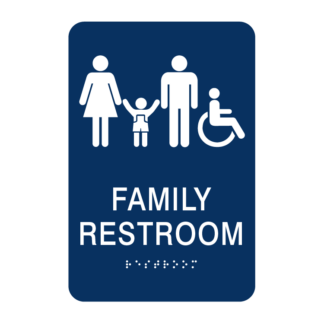
Legal and building-code compliance. In most U.S. jurisdictions, multi-user restrooms are still required to be designated by sex, with specific signage standards. All-gender restrooms are frequently added to a building’s facilities rather than substituted for single-sex ones. None of this makes all-gender signage less important. All-gender and single-occupancy restrooms matter enormously for transgender and nonbinary people, parents with kids of a different gender, and caregivers assisting someone with a disability. The two signage systems solve different problems, and a well-designed building typically offers both.

[||]

What the law actually requires

Restroom signage isn’t just a design choice — it’s regulated. Here’s what generally applies in U.S. commercial and public buildings:
ADA (federal) requirements. Under the 2010 ADA Standards for Accessible Design, restroom identification signs must include raised tactile characters between 5/8 inch and 2 inches tall, with Grade 2 Braille placed directly below the text. The ADA treats restroom signs as permanent room identification signs, so they’re subject to strict rules on tactile characters, Braille, contrast, and mounting location.

Shape conventions. Doorways to a men’s restroom are typically marked with an equilateral triangle, while women’s restrooms use a circle; gender-neutral restrooms often combine both shapes — a triangle superimposed on a circle. The ADA itself doesn’t strictly require pictogram shapes; the tactile text and Braille are the actual federal requirement, and pictograms are commonly layered on top by convention or state code.

Mounting height and location. ADA-compliant signs generally must sit within a specific height range (roughly 48–60 inches from the floor) on the latch side of the door, with clear floor space in front so someone using a wheelchair can approach and read the sign without the door swing getting in the way.

State add-ons. States can layer on additional requirements through their own building codes — California’s Title 24, for example, adds its own restroom door-sign rules. California’s AB 1732 (the Equal Restroom Access Act) separately requires that single-user restrooms be labeled as all-gender — a rule specific to single-occupancy rooms, not multi-stall facilities.

Penalties for noncompliance. Getting this wrong isn’t just a design slip. ADA signage violations can carry significant fines, and inaccessible signage creates real barriers and legal exposure for a business. The bottom line: single-sex signage and all-gender signage aren’t legally in conflict. In most places, codes require proper signage for sex-designated restrooms and, increasingly, options for all-gender or single-occupancy facilities.

[||]

Sign-Frame.com offers a wide range of compliant, high-quality women’s restroom signs, men’s restroom signs, and all gender restroom signs. The choices can be overwhelming, but we are here to help. If you can’t find exactly what you are looking for, reach out to us, we’ll be happy to help you select the right sign option from the thousands of signs in our Vista Systems catalog.
[||]

Women’s Restroom Signs – Common Questions


Are gender-neutral restroom signs legally required?

It depends on where you are. Requirements vary by jurisdiction and building type — some states and cities mandate all-gender restroom options in certain facilities, while others leave the decision to the building owner. Local building codes are the source of truth for any specific address.


What shape is a women's restroom sign supposed to be?

By common convention (and in several state codes), a circle designates women’s restrooms, a triangle designates men’s, and a triangle-over-circle marks gender-neutral restrooms. That said, the ADA itself doesn’t strictly mandate these pictogram shapes — the legally required elements are the tactile text and Braille; the shapes are a widely used design convention layered on top.


Does a women's restroom sign need Braille?

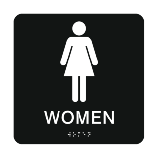
Yes, for multi-user restrooms. Signs reading “Women” (or “Men”) must display the word in tactile, raised characters with Grade 2 Braille directly beneath it, so the sign works for sighted visitors and for visitors who are blind or low-vision alike.


Posted on

Church Sign Maker: How to Design the Right Sign for Your Church

Finding the right church sign maker can feel like a big decision. Your sign is often the first impression visitors get of your congregation, and it needs to be welcoming, easy to read, and built to last through years of weather and wear. Whether you’re outfitting a new building or refreshing an outdated sign, this guide will help you understand your options and choose a solution that fits your budget and your ministry’s needs.

What to Look for in a Church Sign Maker

Not all sign companies are created equal. When you’re comparing a church sign maker, keep these factors in mind:

  • Durability – Your sign needs to hold up to sun, rain, and wind for years without fading or cracking.
  • Flexibility – Church schedules, sermon series, and staff change often. Your sign should be easy to update without a full replacement.
  • Design support – You shouldn’t need a graphic design degree to create a professional-looking sign.
  • Cost over time – A cheap sign that has to be replaced every couple of years often costs more in the long run than a well-built one.

Sign-Frame.com: A Popular Church Sign Maker Option

Sign-Frame.com is a popular sign maker option for churches of all sizes. We offer a church sign maker with our online design tool, along with premium-quality interior and exterior architectural signs built to represent your congregation well, inside and out.

If you’d rather handle things yourself, we also offer a DIY route: you can buy customizable sign frames and print your own inserts, giving you full control over your design and timeline.

Why Changeable Inserts Matter

One of the biggest advantages of our sign frames is the ability to swap out inserts whenever you need to. Instead of ordering an entirely new sign every time a pastor changes, a service time shifts, or a sermon series wraps up, you simply print a new insert and slide it into your existing frame.

This approach:

  • Reduces the lifetime cost of ownership of your signage, since you’re not paying for a brand-new sign every time something changes.
  • Eliminates the need to call a sign company every time you need an update.
  • Lets you keep your signage current and accurate at all times, without added downtime or expense.

Not Sure What You Need? We’re Here to Help

Our catalog includes thousands of high-quality products, and we understand it can be overwhelming to figure out exactly what fits your space, your budget, and your goals. If you can’t find what you’re looking for, or you have any questions about our products, we’re happy to help — just give us a call.

Frequently Asked Questions

How much does a church sign cost?

Church sign pricing varies widely depending on size, material, illumination, and whether it’s a monument sign, wall-mounted sign, or interior directory. Simple frame-and-insert systems are typically far more affordable than custom-built signs, especially once you factor in the cost of future updates.

What is the best material for a church sign?

For outdoor signs, durable materials like aluminum, PVC, and weather-resistant composites hold up best against sun and rain. For interior signage, acrylic and aluminum frame systems offer a clean, professional look while remaining easy to update.

Can I design my own church sign online?

Yes. Many providers, including Sign-Frame.com, offer an online design tool that lets you create a professional church sign without needing design experience. You can preview your layout before ordering.

How do I choose the right sign for my church?

Think about location (interior vs. exterior), how often the content will change, your budget, and whether you want a fully custom sign or a reusable frame system with printable inserts. If you’re unsure, reaching out to a sign specialist can help narrow down the right fit.

What size should a church sign be?

Sign size depends on placement and visibility needs. Roadside monument signs generally need to be larger and readable from a distance, while interior directory signs can be smaller and more detailed since they’re viewed up close.

Posted on

Interior Church Signs: A Complete Guide to Wayfinding, Welcome, and Compliance

Church Signage Guide

Interior Church Signs: A Complete Guide to Wayfinding, Welcome, and Compliance

How thoughtful interior signage helps guests feel welcome, keeps members oriented, and keeps your building compliant — plus answers to the questions churches ask most.

Walk into any church for the first time and the experience is shaped long before the sermon starts. It starts in the parking lot, continues through the front doors, and is guided — or muddled — by the signage along the way. Interior church signs are one of the most overlooked tools a congregation has for making guests feel welcome, helping members find their way, and keeping a facility organized and compliant.

Whether you’re outfitting a brand-new building or updating a decades-old sanctuary, this guide covers what interior church signs are, why they matter, the design principles that make them effective, and how to plan a system that grows with your congregation.

A welcoming church sign greeting visitors at the entrance
Photo by Jack Niles on Unsplash

Why Interior Church Signs Matter

Most churches invest heavily in exterior signage — marquees, monument signs, banners — but underestimate how much interior signage shapes a visitor’s experience once they’re through the door. Consider a first-time guest arriving mid-week for a small group meeting, or a family trying to find the nursery on a Sunday morning with a toddler in tow. Clear, well-placed interior signs remove the friction and anxiety that comes with not knowing where to go.

Beyond hospitality, interior church signs serve several practical purposes:

  • Wayfinding — directing traffic to the sanctuary, classrooms, restrooms, offices, and fellowship halls
  • Identification — labeling rooms, staff offices, and ministry spaces
  • Compliance — meeting ADA accessibility requirements for restrooms, exits, and room identification
  • Communication — announcing events, service times, and giving opportunities inside the building
  • Branding — reinforcing your church’s identity, mission statement, and visual style throughout the facility

A thoughtful interior signage system does all of this quietly, in the background, so people can focus on why they came.

Types of Interior Church Signs

Most churches need a mix of the following sign types to create a complete interior system:

  1. Welcome and lobby signs — the first indoor touchpoint, often featuring a mission statement or welcome message
  2. Directional and wayfinding signs — arrows and directories pointing toward the sanctuary, children’s ministry, restrooms, and offices
  3. Room and door signs — identifying classrooms, nurseries, offices, and multipurpose rooms
  4. ADA-compliant signage — tactile lettering and Braille for restrooms and room identification
  5. Changeable message signs — for weekly announcements, sermon series titles, or event promotion
  6. Permanent dedication and donor signage — memorial walls, building dedications, and giving recognition
Interior directional and room signage in a hallway
Photo by Doug Vos on Unsplash

Design Best Practices for Interior Church Signs

Good interior signage isn’t about decoration — it’s a system that reduces confusion and reflects the character of your church. A few core principles apply across almost every space:

  • Consistency first. Use the same fonts, colors, and iconography across every sign so visitors instantly recognize what they’re looking at.
  • Sightline placement. Mount signs at eye level and at natural decision points — hallway intersections, stairwell landings, and entrances — rather than scattering them randomly.
  • Contrast and legibility. High contrast between text and background, along with generously sized lettering, makes signs easy to read from a distance and for guests with visual impairments.
  • Keep messaging simple. One clear instruction or label per sign. Overloaded signs slow people down instead of helping them.
  • Match your architecture. A rustic wood-and-metal aesthetic works for some congregations, while a modern acrylic or backlit look fits others. Signage should feel like part of the building, not an afterthought bolted onto it.

Frequently Asked Questions About Interior Church Signs

Do churches legally have to follow ADA signage laws?

Generally, yes, for signage identifying permanent rooms and spaces. The Americans with Disabilities Act (ADA) requires tactile, raised-character lettering and Braille on signs identifying permanent rooms such as restrooms, offices, and exits in facilities open to the public, including many churches. Requirements can vary based on the size of the congregation, the nature of the building, and local building codes, so it’s wise to consult your local building authority or an ADA specialist when finalizing your signage plan — but building in ADA compliance from the start avoids costly retrofits later.

How do you design an effective wayfinding system?

An effective wayfinding system starts with mapping the visitor journey — from the parking lot to the seat they’ll sit in — and identifying every decision point along the way where someone might hesitate or get lost. From there:

  • Place directional signs at intersections, not mid-hallway
  • Use consistent arrows, icons, and color-coding throughout the building
  • Limit each sign to the most relevant information for that specific location
  • Test the system by walking it yourself as a first-time visitor would
  • Reassess after major renovations, new wings, or room repurposing

A good wayfinding system feels invisible; people simply arrive where they meant to go without thinking about it.

What are the best design practices for church interiors?

The strongest interior church signage systems balance warmth with clarity. That means choosing materials and colors that reflect your church’s personality (wood tones, brand colors, modern acrylic, etc.), keeping typography consistent and highly legible, and placing signs at natural sightlines rather than tucking them into corners. Welcome and lobby signage should set an emotional tone — friendly and inviting — while functional signs like restroom or classroom markers should prioritize fast recognition over decoration. Layering both purposes throughout the building creates a cohesive, hospitable environment.

How do churches balance permanent vs. changeable signs?

Most churches need both. Permanent signs — room identifications, ADA signage, donor walls, directional signs — should be built from durable materials since they rarely change and need to hold up over years of use. Changeable signs — weekly sermon titles, event promotions, temporary classroom assignments — should use flexible formats like letter boards, printable inserts, snap-frame signs, or digital displays that staff can update quickly without professional help. A well-planned system designates fixed locations for both types so updates don’t disrupt the overall wayfinding logic of the building.


Building Your Interior Signage System

Whether you’re starting from scratch or refreshing a system that’s grown piecemeal over the years, Sign-Frame.com offers both design-online sign products and print-your-own sign products for churches, so you can choose the approach that fits your team, timeline, and budget.

Want a custom, professionally designed sign? Use Sign-Frame’s online design tool for church signs to create wayfinding, room identification, and welcome signage tailored to your church’s look and layout.

Need to update signage yourself, on your own schedule? Sign-Frame’s print-your-own church sign options let your staff or volunteers print and swap sign inserts in-house — ideal for changeable messages, event signage, and quick classroom relabeling.

A thoughtful interior signage system is one of the most cost-effective ways to make your church more welcoming, accessible, and easy to navigate — for first-time guests and longtime members alike.

Images courtesy of Unsplash photographers and used under the Unsplash License (free for commercial use, no attribution required).
Posted on

Designing a Cohesive Building Signage System That Works

Close-up of warm, illuminated steel cables and glass panels forming a geometric structural facade behind glass walls.

Understanding the key elements of a solid building signage system is imperative in today’s business world. Walk into a well-managed building, and you can tell in seconds if the signage is working. People move with confidence. They find restrooms, elevators, and offices without stopping at the reception desk. Tenants feel proud to bring clients in for a visit.

That is the result of a thoughtful building signage system. It is not just about wall signs. It is about how your building feels and how smoothly it runs each day.

If you manage facilities, property, construction, or design, you already know this. Yet signage still tends to slide to the end of the project list. By then, budgets are tight, and decisions are rushed. The outcome often looks mismatched and ages badly.

Why Your Building Signage System Deserves A Seat At The Table

Think about how many people rely on your building each day. Tenants. Staff. Visitors. Vendors. Delivery teams. Regulators. Every one of them interacts with your building signage system.
When it is clear and consistent, you notice fewer interruptions at reception. There are fewer “Where is this room?” messages. Security and front desk teams handle fewer lost visitors. You also project a stronger level of professionalism from the moment someone walks through the door.
Consider three simple examples:
  1. A tenant brings a major client in for a presentation. The client notices the lobby directory and subsequently takes them to the elevator. They soon find the corporate office sign, arriving relaxed and focused.
  2. A new hire comes in on day one. They can easily find HR, IT, and their workspace. Their first experience with the company feels organized and welcoming.
  3. A contractor arrives for an after-hours job. Clear wayfinding signage leads them to the right mechanical room. Minimizing their navigation time allows them to complete their work faster and with less disruption.
In each situation, the building signage system quietly does its job. It reduces friction. It keeps people moving. It supports the perception that the property is well managed.

The Case For A Modular Sign Family

Now, let us talk about how to design for change. Buildings never stay static. Tenants expand. Suites combine or split. Conference rooms get rebranded. Policies and regulations evolve.
If you rely on one-off signs, every change hurts. It causes one to dig through old emails to find a vendor and try to match colors from years ago. You wait for proofs and production. The costs add up, and the building slowly starts to look inconsistent. A modular sign family changes that story completely.
With a modular approach, you standardize the frames, sizes, and mounting options. You set a clear visual language for interior sign system elements. Room identification, directories, tenant signs, and ADA-compliant signs are all elements within the system. Typically, this system is referred to as a uniform sign code. This sign code is the framework that maintains sign consistency throughout the building or campus.
The uniform sign code serves many purposes; however, its two primary objectives are, first, to protect the building’s aesthetic and brand. Even as tenants turnover, the property still looks intentional and well aligned. Second, it makes updates much easier to manage. You swap panels or inserts instead of replacing full signs. This is faster, cleaner, and more cost-effective over the building’s life.
I worked with a property manager who oversaw several mid-rise office buildings. Before moving to a modular signage system, every tenant change required a new set of custom signs. Lead times stretched to weeks, and budgets became untenable. Over time, the signs no longer looked the same, and the building’s aesthetics suffered.
After shifting to a modular approach, they were able to update tenant names and suite numbers in a single afternoon. The visual alignment across the portfolio improved, and the operating costs dropped.

Business Signage System and Printing Your Own Inserts

One of the most practical shifts you can make is to use sign frames with changeable inserts. Then allow your team to print those inserts in-house.
At first, this can feel risky. You may worry that quality will suffer. In reality, when it is set up correctly, it does the opposite.
Here is how it typically works.
You standardize templates for different sign types. Room names. Job titles. Tenant names. Temporary notices. Your branding and typography are locked in with your room signs. Your team only updates the text.
You use standard paper or film stock that is approved for your frames. Facilities or admin staff print inserts on office printers. They slide the old insert out and the new one in. No special tools. No mess on the walls.
The benefits show up quickly. New hires can have their names on offices or workspaces on day one. Project rooms can be re-labeled in minutes instead of weeks. Temporary wayfinding for events or construction can be created in-house. You avoid rush fees and vendor minimums.
One facilities director for a large non-profit shared that this single change cut their annual sign spend by more than a third. More importantly, they no longer had to apologize for outdated room names or taped paper signs. Their building signage system finally matched the level of professionalism they expected.

Wayfinding Signage That Respects People’s Time

A cohesive building signage system always includes a thoughtful wayfinding strategy. It is not just about more signs. It is about the right information at the right moment.
People should understand three things quickly.
Where they are now.
Where do they need to go?
How to get there in the simplest path.
Well-designed wayfinding signage anticipates decision points such as lobbies, elevators, and hallway intersections. They also consider amenities like restrooms and cafeterias.
For you, this does more than improve comfort. It reduces the soft costs of confusion. Fewer interruptions mean fewer late arrivals and fewer complaints. In environments like healthcare or higher education, good wayfinding also reduces stress at key moments.
Architects and contractors can add real value here by bringing signage thinking into the planning stages. Sightlines. Mounting surfaces. Lighting. All of these influence how effective the wayfinding will be once the building opens.

Aligning Stakeholders’ Business Signage System Values

To make all of this work, everyone must work together as the building has many stakeholders.  This includes business owners, property managers, security, designers, and others.  When properly aligned, successful projects start with a documented, clear standard and share it with all interested parties.
That standard usually covers basics such as color palette, materials, typography, and placement. It also includes message style, naming conventions, and rules for tenant branding within the system.
With that in place, tenant improvements, expansions, and future build-outs become much easier. Your sign vendor can reference the standard, and your contractors know mounting expectations. In addition, the leasing team can show potential tenants what their identity will look like within the building.
A consistent building signage system signals that the building is well-managed. It also protects the building’s value over time.

Infusing Character Without Losing Consistency

Implementing a uniform sign program does not mean dumbing down the building or losing historical significance. In fact, blending modular discipline with local character is hip and very beautiful.
A prime example would be a mixed-use building near a historic downtown. The modular signs follow a clean, modern structure, with local-landmark iconography. Accent colors complement nearby architecture while graphics hint at local history and culture.
The result feels rooted without becoming theme park-like. You maintain the integrity of your building signage system while still honoring the neighborhood and community. Tenants appreciate that their workplace or residence reflects its surroundings respectfully.

Building Signage System Realities

building-signage-system
Building Signage System

A building signage system supports operations, experience, and brand. By building in flexibility and empowering teams to print inserts in-house is just the start. When you treat wayfinding as a strategic asset, you respect the time and comfort of everyone who enters the building.

If you are planning a new project or refreshing an existing property, it may help to ask:
Do our signs reflect who we are as an organization?
Can we update them quickly when something changes?
Does our building signage system make life easier for the people who use this place every day?
If the answer isn’t apparent, it’s okay to pause and revisit the approach. An investment in a smarter, more cohesive signage strategy will pay off in reduced friction, lower long-term costs, and a stronger overall impression of your asset.
Posted on

5 Creative Church Sign Design Ideas That Inspire

Ever consider the impact of a church sign in a place of worship? Walk into any church for the first time, and you can feel right away if the space feels welcoming. While architecture and people play a role, signage quietly shapes that first impression. A well-designed church sign helps guests feel confident, comfortable, and oriented within minutes.
Visible signage for churches removes uncertainty. Clear signage helps parents find children’s ministries without stress. It also guides newcomers to worship spaces without having to wander aimlessly around campus.  Most importantly, it reinforces the congregation’s character and values.
Modular and changeable systems take this impact even further. Churches evolve constantly, so flexible signage keeps the environment current without expensive replacements. When done well, indoor church signage becomes part of the ministry experience rather than just a functional tool.

Warm Welcome Signage That Sets the Emotional Atmosphere

Every church should start with a simple and inviting welcome message. This first church sign often sits near the main entrance or lobby. The intent is to provide a warm, comforting feeling and to help guide congregants to the proper location on the church campus.
Designers often use warm colors, approachable typography, and clear language to accomplish that goal. To complement the graphics, using a modular sign system allows seasonal messages or event information to be easily updated. This can be done as often as needed for literally the cost of paper and a little ink!
The benefits are immediate and immeasurable. Visitors feel comfortable, and regular members also appreciate seeing the updated messages showing current activities and seasonal themes. This approach unites emotional impact with practical flexibility. It is one of the most effective church sign ideas because it improves first impressions with minimal effort.

Branded Environmental Church Sign Graphics That Reflect Identity

Church environments feel more empowered when their visual identity appears consistently throughout the space. Branded or church-centric environmental graphics help reinforce mission, values, and culture. This includes overhead or suspended signs, meeting room signs, directory signs, and others. Using modular systems allows designers to update messaging as themes or campaigns change. It keeps the space aligned with the church’s direction without major renovations.
Members often feel a richer connection when they notice familiar colors and language repeated thoughtfully. Guests also obtain a clearer sense of what the church stands for. Indoor church signage that reflects identity helps unify the environment and makes the space feel intentional.
From a practical standpoint, modular graphics reduce long-term costs. Instead of replacing entire displays, teams can quickly update inserts or panels. This makes it easier to keep the space looking current and well-maintained.

Changeable Room Signs Which Adapt as Ministries Grow

Few environments change as often as church interiors. Classrooms shift, offices move, and ministries expand. Traditional engraved signs struggle to keep up with this pace due to the associated cost and time required to get the new sign in place. This is why changeable room signs remain one of the smartest solutions for signage for churches.
A modular church sign system separates the frame from the message. When a room function changes, staff simply replace the insert. The frame stays in place, so updates take minutes instead of weeks, keeping the facility up to date and professional at all times. It also reduces confusion, and parents, especially, appreciate knowing they can trust the signage when dropping off their children.

Intuitive Wayfinding Church Sign Concepts That Reduce Stress and Improve Flow

Wayfinding plays a key role in any building or campus setting, and churches are no exception. Churches often include a labyrinth of corridors, meeting rooms, classrooms, and offices. Churches, with their planning teams and carefully thought-out indoor church signage plans, provide simple, clear direction through properly placed navigation signs at key points throughout the building.
Designers emphasize clear typography, strong contrast, and logical placement. Modular directional signs allow teams to adjust arrows or destinations as layouts evolve. This keeps navigation accurate without redesigning entire systems.
The benefit goes past convenience. Clear wayfinding reduces stress and helps visitors focus on the purpose of their visit rather than worrying about getting lost. It also improves traffic flow during busy services and events.
When people can move through a space with ease, they feel more comfortable returning. That makes effective wayfinding one of the most valuable church sign ideas from both a practical and emotional standpoint.

Storytelling Graphics That Create Meaningful Moments

Church spaces frequently include opportunities to encourage contemplation. Storytelling graphics can highlight scripture, mission statements, or key moments. These visual moments contribute depth and meaning to hallways and gathering areas.
Modular displays make it easy to rotate messages throughout the year. Seasonal themes or sermon series can appear without permanent changes to the walls. This makes the environment engaging and relevant.
The benefits include the ability for members to pause, read, and reflect, which strengthens their connection to the space, while guests can gain insight into the church’s values and story.

Why Modular Church Sign Systems Deliver Long-Term Value

Modular church signage stands out because it supports both imagination and practicality. Churches rarely remain static, so signage has to adapt as they grow, much like businesses do. A changeable church sign system allows teams to update messaging quickly while maintaining a consistent message throughout the campus.
In addition, it’s not just the initial purchase that matters. The ongoing maintenance of these signs can become costly over time. With a modular sign system, the costs are significantly mitigated because only the insert, not the frame, needs to be updated. It also allows church administration, facility personnel, and volunteers to focus on the church’s core mission rather than recurring maintenance.
Most importantly, modular systems give churches the freedom to communicate effectively as their ministry evolves. This provides the flexibility needed to focus on daily operations and long-term planning.

Church Signs Allow People to Feel Welcome and Comfortable

church-sign
Modular Church Signs

Great signage quietly supports every exchange inside a church. It welcomes newcomers, guides families, and supports identity. When carefully designed, indoor church signage becomes part of the overall experience rather than just a functional necessity.

Creative design ideas paired with modular systems give churches the best of both worlds. They gain the capability to inspire while continuing flexibility. As ministries grow and spaces change, signage can evolve without losing consistency.
If there is one takeaway, it is this. A well-planned church sign strategy helps people feel comfortable from the moment they walk through the door. That feeling of clarity and welcome makes a lasting impression and encourages people to return again and again.
Posted on

How Office Door Signs Save Time and Money for Businesses

Walk through almost any office, and you will notice that office door signs are never static. Change happens constantly. People move offices, departments shift, and roles evolve. Yet many businesses still depend on static signage that was never designed to keep up with the pace of change. That is where modern office door signs make a real difference.
When you choose a flexible system, you remove a surprising amount of friction from daily operations. Instead of worrying about replacements or delays, you gain a simple way to keep your space up to date and professional at all times. More importantly, you free up time and energy to focus on the work that actually drives growth.  The ability to focus on your customers and generate sales and profitability for the business. This is where modular office signage can help get that time back and free up your day.

The Hidden Cost of Traditional Door Signage

At first glance, traditional signs look straightforward. You order them, install them, and move on. However, the real costs surface later as changes begin to pile up. For example, every time an employee moves or a department reorganizes, new signs need to be made. Someone has to place an order, wait for production, schedule installation, and dispose of the old sign. Those steps may seem small, yet they add up quickly over the course of a year or multiple years.
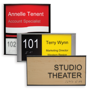
The good news is that changeable office door signs eliminate that process completely. Instead of replacing the entire sign, you simply update the insert. That small shift saves both time and money while reducing disruption across your office. The following illustrates what changeable office door signs can potentially look like. You may customize them with your color(s), logo, and more, and match them to your interior decor.

Why Flexible Office Door Signs Change Everything

Business leaders rarely think about signage until it becomes a problem. A missing nameplate or outdated title can create confusion for visitors and frustration for staff. Fortunately, interchangeable office door signs solve that issue before it starts.
Because updates take only minutes, your space stays current without planning or delays. That flexibility also helps teams adapt faster when growth or restructuring occurs. As a result, your environment always reflects how your organization actually operates. Over time, that consistency establishes trust with both employees and guests. People notice when details feel intentional and well-maintained.

How Modular Systems Support Daily Operations

Think about how often small changes happen in a typical office. A new hire joins the team, a manager moves to a new office, or a conference room gets repurposed. Each of these instances requires a simple update, yet it requires a lot of time if you have to call the local sign company. With personalized office door signs that use changeable inserts, those updates become routine tasks instead of special projects.
Office managers can handle them in-house without tools or outside help. That convenience keeps your workflow steady and predictable. Even better, teams no longer need to keep track of replacement orders or installation schedules. The signage system simply works in the background while you focus on higher priorities.

Long-Term Savings That Add Up

In our experience, cost savings rarely come from the initial investment; they come from eliminating recurring expenses that occur over time. As a side benefit, the modular nature provides a common look and feel throughout the building. This includes directory signs, table signs, cubicle signs, and others to complement office door signs.
More specifically, when you initially invest in a changeable door sign, you avoid paying for full replacements each time something changes. Over several years, that difference can be significant, and the system pays for itself faster than expected. At the same time, fewer replacements mean less waste. That practical benefit supports both your budget and your eco-friendly objectives.  Most modular sign systems are sustainable, with manufacturers investing in infrastructure and practices to ensure it.

Sustaining a Professional Appearance

A polished environment shapes how people perceive your organization. Clean, consistent office door signs signal attention to detail and professionalism from the moment someone walks in.
Custom office door signs let you align typography, colors, and layouts with your brand standards, and employees benefit from clear identification throughout the building. When rooms and offices are easy to find, everyone benefits. Solid wayfinding signage helps visitors navigate the building quickly and efficiently.

Supporting Growth Without Disruption

When businesses grow, there’s excitement tempered by the work effort required to support it. Expanding office space, new staff responsibilities, and increased sales can strain existing systems, especially those that were not designed for change. For most business professionals, signage is the last thing on their list and one they would rather not stress over.
Changeable office door signs scale naturally as your organization evolves. You can add new inserts, update names, or reassign spaces without replacing the entire system. That adaptability keeps your environment aligned with your development path. As a result, you avoid the stop-and-start cycle that traditional signage creates. Instead, your space evolves smoothly along with your business.

Choosing the Right Office Door Signs for Your Space

Not all signage systems deliver the same experience. When evaluating options, durability should be at the top of your list. A well-built frame protects your investment and keeps the sign looking sharp over time. Ease of updates also matters. The best interchangeable office door signs allow quick, tool-free insert changes. That simplicity ensures your team will actually use the system as intended.
Design flexibility remains another key factor. Look for solutions that support a range of insert styles, finishes, and sizes. This approach allows your signage to complement rather than compete with existing interiors. One solution is Vista System, which offers a comprehensive suite of office signage, though there are others on the market. Do your research and decide which is right for you.

The Freedom to Focus on What Matters

Every operational improvement creates space for better focus. When you remove small but recurring tasks, your team gains more time for meaningful work. Office door signs may seem like a minor detail, yet they influence how smoothly your workplace runs.
By choosing custom door signs with a modular approach, you eliminate the constant cycle of replacements and updates. With that freedom, the focus can stay on your customers, business strategy, and sales rather than on administrative tasks.

A Smarter Way to Think About Office Door Signs

office-door-signs
Office Door Signs

It helps to view signage as part of your operational infrastructure rather than a one-time purchase. When due diligence and adequate research are done up front, modular door signs support efficiency, clarity, and professionalism across your organization.

Office door signs that adapt to change present a practical advantage in today’s fast-moving environment. They reduce costs, simplify updates, and help maintain a clean appearance without extra effort.
Most importantly, they remove one more distraction from your plate so you can stay focused on building and leading your business.
If you are looking for a simple way to improve effectiveness and maintain a professional environment, modular signage is a smart place to start.
Posted on

Vista Systems vs Traditional Signage: Why Changeable Signs?

Vista Systems Changeable Signs Stand Apart From Traditional Sign Solutions

Vista Systems has built a strong reputation across the architectural signage industry over its 30 years in business. They deliver flexibility, consistency, and a pleasing aesthetic appearance that complements the most discriminating business settings. More importantly, they solve a very practical problem faced by most businesses by making sign maintenance simple without sacrificing design.
The following illustrates the primary advantages of Vista Systems signage compared to other sign options. The intent is to provide a clear understanding so that one can make a well-informed, confident decision when purchasing signage for your business.

Understanding How Vista Systems Works

Vista Systems are modular architectural sign solutions built around curved aluminum extrusions and changeable inserts. Instead of engraving or permanently printing the message onto the sign face, the message lives on a removable insert. That insert slides into the frame and can be replaced when information changes.
This simple concept makes a big difference in day-to-day operations. Rather than ordering a completely new sign, you only update the insert. The frame stays in place, keeping your environment consistent and reducing waste.
Vista signs come in many formats, including room signs, directories, hallway signs, and wall-mounted wayfinding signs. Because the design language remains consistent across all types, facilities can preserve a unified look from the lobby to the smallest office door.

Flexibility That Keeps Up With Today’s Business Environment

One of the biggest advantages of Vista Systems is its ability to adapt to change. In most facilities, change is not occasional. Staff turnover, departmental restructuring, and tenant updates happen all the time, especially post-Covid.
For example, with traditional engraved plaques, whenever a person’s name or title changes, a new sign must be purchased. This implies calling the local sign company and hoping for a return call. It also means additional costs, delayed production, and coordination issues with installers.
The good news is that Vista sign frames remove that friction. You simply print a new insert and slide it into place. Many organizations manage updates in-house, which saves time and keeps operations moving smoothly. As a result, the signage stays accurate without having to call the local sign company. It also means no delays, coordination issues, or incremental costs.

Vista Systems and Long-Term Cost Efficiency

The upfront, one-time initial purchase is just one part of the equation when choosing signage. However, the real cost extends through the life of the sign. This is the true benefit of choosing Vista Systems compared to traditional sign suppliers.
By keeping the frame and only replacing the inserts, you avoid the expense of a full sign replacement. Over time, especially in larger buildings or campus settings, the savings can be substantial. It also reduces administrative overhead, as updates are faster and easier to manage.
To be fully transparent, lower-cost modular systems exist, but they typically lack the durability and quality of Vista frames. On more than one occasion, we’ve had to replace Vista Systems’ “knock-off” signs for those reasons, causing the customer to pay almost twice the cost of the signs up front. It’s very attractive to see lesser-priced alternatives, but you typically get what you pay for in that regard.

Modular Design Across All Sign Types

Consistency plays a major role in how people perceive a space. When signage looks cohesive, it strengthens professionalism and helps visitors feel oriented. When sign styles vary, the environment can feel disjointed. Vista’s modular sign frames provide that consistency, whether or not an existing sign program is in place.
To be specific, Vista’s product lines include directory signs, office signs, cubicle signs, and many other sign types, all of which share a common look and feel. This means that no matter what hallway, floor, or building you enter, you will see the same style of sign. With both flat and curved profiles, Vista signs create a modern architectural look that suits most business decor.

A Professional Appearance That Improves the Environment

Vista systems offer a refined appearance that matches modern interiors without feeling overly decorative. The aluminum construction features a clean, durable finish, while the inserts allow for a full range of colors and graphics to complement your brand.
Many competing modular sign products focus primarily on cost, whereas Vista frames keep a balance between visual attractiveness and practical performance.

Vista Systems Durability That Holds Up Over Time

High-traffic areas, cleaning routines, and daily wear can quickly expose weaknesses in lower-quality products. Vista sign frames are built with sturdy materials that stand up well in demanding settings.
The aluminum extrusions resist damage and maintain their visual appeal over time. Because the inserts are protected within the frame, they are less likely to show wear compared to surface-mounted graphics. This helps signage maintain a professional appearance even after years of use.

How Vista Systems Compares to Traditional and Custom Signs

Traditional engraved signs still have their place, especially in environments where information rarely changes and in some pseudo-exterior environments where paper is not an option. That said, they lack the flexibility that most modern settings require, namely the ability to avoid ordering a new sign for each update, saving both time and money.
Custom-fabricated signs can deliver a unique look, but they often come with longer lead times and higher replacement costs, whereas Vista Systems offers a middle ground. Vista offers a strong architectural aesthetic with the added ability to update quickly, making it a logical choice for organizations that value both design and capability.

Real-World Applications Where Vista Systems Excel

Healthcare, education, and corporate are just three vertical industries that benefit greatly from Vista Systems’ versatility. When departments shift, staff changes occur, titles change, etc., changeable insert signs make a lot of sense.
As teams grow and reorganize, signage can keep pace without calling for constant replacement. This helps maintain a clean appearance throughout the workplace. The ability to update quickly while preserving consistency makes Vista Signs a reliable solution.

When Vista Systems Is the Right Choice

vista-systems-sign-frames
Vista Systems Sign Frames

Vista Systems signage works best in situations where information changes periodically and design consistency matters. They are ideal for organizations that want a professional look without committing to frequent full replacements.

Choosing signage is both a practical and calculated decision. You want a solution that looks professional today yet continues to outperform over time. Vista Systems offers a combination of flexibility, durability, and design consistency that addresses real business needs.
By reducing replacement costs and simplifying updates, they support smoother facility management. At the same time, their clean architectural appearance augments the overall environment. For many organizations, that balance makes Vista Systems a smart investment that pays off over time.
We welcome the opportunity to assist in making an informed decision on your next purchase. Please give us a call or request a quote for more information on Vista Systems signage or architectural signage in general!
Posted on

Choosing Women’s Restroom Signs for Your Business

Looking for women’s restroom signs for your business?  If so, this guide should help you make an informed purchasing decision.  On the surface, selecting the right restroom signage for your facility appears straightforward until you start researching the various options. There are numerous choices involving materials, mounting methods, and compliance requirements. That said, making an informed decision about women’s restroom signs doesn’t have to feel overwhelming.
The following will lead you through the main factors to consider when making that purchasing decision.  This should help you understand exactly what to look for when purchasing restroom signs for business that meet regulations while improving your space.

Understanding ADA Compliance Requirements

First and foremost, your womens restroom sign must meet federal accessibility standards. The Americans with Disabilities Act establishes specific requirements that must be followed. These rules exist to ensure everyone can navigate your facility independently.
Your signs need raised characters that people can feel and Grade 2 Braille. The haptic elements require specific dimensions and stroke width to be compliant, along with the mounting height. ADA-compliant women’s restroom signs must be installed between 48 and 60 inches from the floor to the centerline on the latch side of the door.  An ADA installation guide is typically available within your locality to ensure proper compliance.
In addition, you’ll need adequate color contrast between the text and background. Most reputable manufacturers provide a color contrast chart to ensure compliance.  This helps people with visual impairments locate and read your signage more easily. Non-compliant signs can result in costly violations and potential lawsuits. Therefore, working with a knowledgeable supplier who understands these requirements is vital.

Choosing the Right Materials for Your Women’s Restroom Signs

The materials you select for your restroom signs impact both appearance and longevity. Acrylic signs are by far the most popular, offering versatility, style, and a competitive price point. Brushed metal, including aluminum or stainless steel, conveys class and permanence, albeit at a higher cost.
Changeable insert signs, such as those supplied by Vista System are a great example of high-quality aluminum signs with easy-to-update inserts.  It’s an inexpensive option when sign content changes frequently, saving both time and money on ongoing maintenance.
Photopolymer has become increasingly popular for ADA women’s restroom signs, especially in public-facing environments. The photopolymer fabrication process permits precise tactile characters and Braille while offering excellent durability. It also resists fading and maintains its appearance, especially in high-traffic areas.
Wood composites provide warmth and natural appeal; however, they typically require more maintenance than man-made alternatives. Choosing the right material should be based on your customer traffic volume, standard maintenance procedures, and overall aesthetic design.

Design Considerations and Workplace Aesthetics

Your ladies’ restroom sign serves a functional purpose while enhancing overall aesthetics. Balancing these elements requires proactive design elements and evaluation.
Brand identity is the first consideration.  Whether a tech startup with minimalist design preferences or a historic building with customary styling, your signage should feel cohesive with your existing interior design and decor.
Typography is another design consideration and also a key component in compliance. Sans-serif fonts generally offer better legibility from a distance and are required for ADA compliance. Additionally, kerning or adequate letter spacing prevents characters from visually blending together.
Finally, color choices are also a key consideration. High contrast combinations improve wayfinding for everyone, not just the visually impaired. Classic combinations like white on dark backgrounds or dark on light backgrounds work reliably.  Most suppliers have ADA color contrast guides to ensure color choices for your women’s restroom signs meet ADA compliance standards.

Women’s Restroom Signs and Environmental Aspects

Assessing your existing surroundings and the volume of customer traffic are two factors to consider when choosing the type of materials to use. High-traffic, frequent cleaning, accidental impacts, random vandalism, and constant use will affect their longevity. Consequently, investing in high-quality materials for these factors will mitigate maintenance and replacement costs.
Lighting conditions also influence visibility. Poorly illuminated hallway corridors require signs with enhanced contrast or potentially illuminated options. Conversely, areas with abundant natural light need materials that resist fading and discoloration.  The graphics and text are also a factor.  The standard rule of thumb is one inch character height for every ten feet of distance for proper visibility.

Installation Methods and Best Practices

Mounting your ADA-compliant women’s restroom signs affects both compliance and effectiveness. ADA guidelines specify that signs must be installed on the wall adjacent to the latch side of the door.
Permanent mounting commonly involves screws or heavy-duty adhesive delivering security and stability for permanent installations.
Semi-permanent options use removable adhesive or changeable mounting frames. These systems enable simpler, easier updates while maintaining a professional appearance and ADA compliance. Consider your future needs when selecting an installation method from both a cost and maintenance perspective.

Monetizing Your Overall Investment

Understand that high-quality restroom signs represent an investment in your facility’s wayfinding functionality and brand image. Modular signs, with a common look and feel, help drive consistency across building floors and campus environments.
For example, maintenance requirements vary widely by material and finish, where some signs clean easily with standard solutions, while others require special care. Assess the level of maintenance needed upfront to ensure you’re choosing the right materials.
In addition, reputable sign manufacturers typically offer warranties on their sign products. Warranties demonstrate confidence in quality and provide recourse in case of problems.  If not listed on their website or catalog, please inquire before purchasing your women’s restroom signs to clearly understand their warranty policy.

Women’s Restroom Signs in a Nutshell

womens-restroom-signs-bp01Choosing women’s restroom signs involves more than picking something that looks nice. Decisions such as compliance, user experience, and aesthetics also play a factor. Consult your sign provider or local inspector to confirm your local ADA requirements for your office building, evaluating materials based on your environment and traffic patterns. Work with suppliers who understand both regulatory requirements and design principles. Ask questions about materials, installation, and long-term performance.


A knowledgeable partner helps you avoid costly mistakes while achieving the results you envision.
If in doubt, contact your local sign provider for more detailed information.  Ask for a consultation or on-site visit to ensure your issues are addressed.  This is free of charge and will help in your decision-making process.
Posted on

Why Sign Holders Make Sense for Your Business

How many times have you ordered new sign holders this year? If you’re like most business owners, the answer might surprise you. Between staff changes, departmental shifts, and updated regulations, signage costs add up fast.
There’s a smarter way to handle this. Changeable sign holders give you control over your signage without the recurring expenses. Let’s explore why more businesses are making the switch.

Sign Holders Drive Cost-Effectiveness Over Time

Think about what you’ve spent on signage over the past year. Every time someone leaves or joins your team, you need new nameplates. When departments reorganize, you need new directional signs. Seasonal promotions require fresh retail sign holders.
Traditional permanent signage comes with a hidden price tag. You’re not just paying for the sign itself. You’re paying for design time, fabrication, shipping, and sometimes installation. Multiply that by every change throughout the year, and you’re looking at a significant expense.  Whereas, changeable sign holders flip this model on its head. You make a one-time investment in quality frames. After that, updates cost you almost nothing. Your team can print new inserts on standard office equipment. There’s no waiting on vendors or paying rush fees.
For example, consider a mid-sized office with 50 employees. Annual turnover averages 15% in most industries, which means at least seven or eight nameplate changes per year. Conservatively, at $25 to $40 per standard, off-the-shelf sign, you’re spending several hundred dollars annually on nameplates alone. Meanwhile, changeable table sign holders let you update these for pennies. Consequently, you recoup your initial investment quickly, often within the first year.  There’s no added cost in the initial purchase above what you would have normally spent.  You pay once and enjoy “free” maintenance for the life of the signs.

Immediate Updates Without Downtime

Information changes fast in business. A conference room gets reassigned. An employee moves to a different desk. A temporary closure needs immediate posting. You can’t afford to wait three weeks for new signs.
Speed matters when accuracy is critical. Outdated signage confuses visitors, frustrates staff, and also looks unprofessional. Clients notice when nameplates don’t match current employees or when room directories are wrong.
With changeable wall sign holders, updates happen on your schedule. Your administrative team handles changes in-house by simply printing new inserts. Most importantly, there’s no vendor back-and-forth, no proofing delays, and no shipping wait times. You need a new insert? Print it and swap it out. The whole process takes minutes.
This promptness is especially valuable inside dynamic environments. Healthcare facilities need current patient information. Retail locations require timely promotional messaging. Co-working spaces must reflect today’s desk assignments, not last week’s. Furthermore, you keep control over quality and timing. You decide when changes happen. You’re not at the mercy of a sign shop’s production schedule.

Professional Consistency Across Locations

Brand consistency challenges every multi-location business. You want each office or store to feel cohesive. Yet each location needs customized information. This is where changeable sign holders genuinely shine. The frames provide visual harmony across all your locations. Whether you choose metal sign holders for a contemporary style or classic styles for traditional spaces, that aesthetic remains constant. Only the content changes.
For example, think about a retail chain with 20 locations. Each store needs employee nameplates, departmental signage, promotional displays, shelf talkers, and more. Traditional signage means coordinating orders across multiple locations, guaranteeing everyone uses the same specifications, and hoping the finished products match. Changeable systems eliminate these headaches. You order identical sign holders once. Then each location customizes their own inserts using your branded templates. The result is consistent uniformity with local flexibility.
Having a uniform sign schedule also simplifies training and maintenance. Staff across all locations learn a single system, and replacement signage is easy to procure. The facilities team doesn’t need to track different mounting hardware or frame styles for different offices. Additionally, consistency builds brand recognition. Customers moving between locations experience familiar visual cues. This reinforces your professional image and creates confidence.

Sign Holders are Designed for Flexibility for Flexible Environments

Business moves fast these days. Offices adopt hot-desking. Conference rooms fulfill various functions. Retail displays rotate with inventory. Your signage needs to keep pace.
Static signs lock you into yesterday’s configuration. Changeable sign holders adapt as your needs evolve. Such flexibility backs modern workplace trends without sacrificing professional appearance.
Hot-desking presents a perfect example. Employees no longer have assigned spaces. Yet visitors still need to find people. Changeable table sign holders let you update desk assignments daily if needed. The same principle applies to meeting spaces that serve different teams throughout the week.
Retail environments benefit enormously from this adaptability feature. Seasonal promotions change monthly or even weekly.  With retail being a “me too” environment, products are promoted based on competitor offers so as not to lose competitive advantage. In addition, product lines shift according to consumer demand. Changeable retail sign holders let you refresh messaging without replacing entire display systems.
The same is true in healthcare, where they too face similar challenges. For example, patient rooms change occupancy, department services expand or contract, and doctors occupying in-house suites come and go. Flexible signage accommodates these shifts seamlessly. Moreover, this suppleness extends your signage lifespan. You’re not throwing away perfectly good signs because the information changed. The hardware continues serving you year after year.

Sustainability and Waste Minimization

Let’s examine something that matters to businesses and customers alike. Environmental accountability isn’t just good ethics anymore. It’s good business.
Traditional signage replacement creates considerable waste. Acrylic, aluminum, and vinyl all end up in landfills when signs become outdated. Multiply this across all your location changes, employee turnover, and promotional cycles. The environmental impact adds up.
Changeable sign holders dramatically reduce this waste stream. The frames are built to last years, even decades. Only the paper inserts need replacing. Most businesses print these on recycled paper.
This is consistent with corporate eco-friendly aims that many organizations now prioritize. You can quantify your waste reduction. That’s meaningful data for sustainability reports and stakeholder communications.
Additionally, reduced shipping frequency lowers your carbon footprint. You’re not receiving constant sign deliveries. One shipment of sign holders serves you indefinitely. Updates happen in-house with no transportation emissions.
Customers notice these efforts too. Consumers increasingly choose businesses which demonstrate environmental accountability. Your signage system may appear as a minor detail, but it adds to a larger sustainability story.

Making the Switch to Changeable Sign Holders

sign-holders-with-changeable-inserts
Changeable Office Sign Holders from Vista System

Changeable sign holders represent more than a product purchase. They’re a tactical decision that gives you control over your signage program. You gain flexibility, reduce costs, and maintain professional standards simultaneously.

The initial investment pays dividends through reduced replacement costs and increased operational efficiency. Your team spends less time liaising with vendors and more time on main business activities. Updates happen when you need them, not when a sign shop’s schedule allows.
Whether you need wall sign holders for directional purposes, table sign holders for desks and counters, or retail sign holders for merchandising, the changeable approach adapts to your specific requirements.
The first step in making the switch is to evaluate your current signage costs and opportunities for improvement. This includes your monthly spend on replacement signage, combined with the delayed updates because you don’t have the time to place the order.
Smart businesses choose flexible systems that expand and adjust with them. Changeable sign holders deliver that flexibility without sacrificing professional appearance. That’s an investment worth making.
Posted on

Procuring ADA Signs for Your Office – A Complete Guide

Getting ADA signs right for your office building might seem daunting at first. However, once you understand the process, it becomes a straightforward series of informed decisions. This guide will walk you through each step, helping you create a compliant and professional wayfinding system that serves everyone who enters your building.

ADA Signs – Understanding What You Actually Need

Before you order a single sign, you need to know which signs require ADA compliance. Not every sign in your building falls under these regulations. Permanent room identifications, such as restrooms, stairwells, and room numbers, must meet strict standards. Meanwhile, temporary signs and most directional signage have more flexibility.
Start by walking through your building with your architectural plans in hand. Identify every permanent room that needs identification. Pay special attention to ADA bathroom signs, as these are among the most scrutinized during inspections. Create a comprehensive list that includes office numbers, conference rooms, and all common areas.
This initial audit saves you money and headaches down the road. You’ll avoid over-ordering compliant signs for areas that don’t need them. At the same time, you won’t miss critical locations that absolutely require them.

Navigating the Regulations Without Losing Your Mind

ADA regulations are specific, but they’re not impossible to understand. The key requirements focus on making information accessible to people with visual impairments. Consequently, your signs need both visual and tactile elements.
Text must have a non-glare finish with specific contrast ratios between characters and backgrounds. Characters need to be raised at least 1/32 inch. Additionally, Grade 2 Braille must accompany the raised text. These aren’t suggestions or best practices. They’re requirements that keep your building compliant and welcoming.
The ADA sign height matters more than most people realize. Tactile characters must be mounted between 48 and 60 inches above the floor, measured from the baseline of the lowest character. Furthermore, signs should be positioned on the latch side of doors where possible. Your local building codes might have additional requirements, so check with your jurisdiction before finalizing plans.

Design & Compliance Decisions for ADA Signs

When signing a building, compliance and aesthetics eventually meet. You have more creative freedom than you might think. While the regulations specify minimum standards, they give you room to express your brand identity. Choose fonts that are both ADA-compliant and consistent with your corporate aesthetic. Sans-serif fonts typically work best because they’re easier to read. However, many serif fonts also meet the requirements if you select them carefully. The key is avoiding excessively decorative or condensed typefaces.
Color selection demands careful evaluation of contrast values. Light characters on dark backgrounds or vice versa both work well. Test your color combinations against the required 70 percent contrast ratio.  The following chart represents what a typical ADA color contrast chart would look like where custom ADA signs can incorporate your brand colors while meeting these specifications. Pictograms provide universal understanding across language barriers. Select symbols that are widely recognized and culturally appropriate. The International Symbol of Accessibility, for instance, is required for accessible restrooms and parking.

Choosing Substrates and Materials That Last

It’s pragmatic to source materials for both appearance and longevity. Acrylic offers a modern, professional look and holds up well in interior environments. Metal signs, particularly aluminum, provide outstanding durability and a premium feel in both interior and exterior settings. Vista System provides several suites of office signs that combine both.
Wood materials can work beautifully in the right setting, though they call for careful finishing to maintain proper contrast.  Great for niche or boutique settings, they are also typically the hardest to match should new signs be needed in the future.
The method you choose for creating tactile elements affects both cost and quality. Subsurface engraving with paint fill creates durable, permanent characters. Photopolymer dome application offers excellent tactile quality with design flexibility. Applied acrylic letters provide a dimensional look that exceeds minimum requirements.
Think about your building’s traffic patterns and maintenance schedule. Busy traffic areas need more durable materials and finishes, especially in public-facing environments. Therefore, investing in quality materials initially saves on replacement costs later.

Finding the Right Manufacturing Partner for ADA Signs

Not all sign manufacturers understand ADA requirements equally well. Look for vendors who specialize in ADA Braille signs and can demonstrate their expertise. Ask for samples that you can physically inspect and touch. The Braille should be properly sized and positioned. Raised characters should have the correct height and finish.
Ask for references from similar office building projects. A manufacturer’s track record tells you more than their marketing materials ever will. Additionally, inquire about their quality control processes and compliance verification procedures.
Manufacturing schedules differ greatly between manufacturers, and so can the quality of the finished product. Consequently, it’s important to plan accordingly, especially with remodels or large construction projects. Lead times can range from 10-15 business days to several months. Rush orders are generally available but often come with premium pricing.

Creating Uniform Sign Schedules for Your ADA Signs

Developing a detailed sign schedule linked to your architectural plans helps prevent misunderstandings from project inception through installation. A schedule listing each sign location, sign copy, size, and mounting instructions is imperative for proper signing procedures in the office.
Sign schedules are typically coordinated with construction during new builds and renovations. Typically, general contractors will have local sign companies or sign subcontractors do the installation.  The subcontractors will come in near the end of construction, after painting is complete but before final inspections. Phased installation mitigates disruption, especially in occupied buildings.

Proper Installation Procedures

Since there are different wall types to consider, so are the mounting options. Drywall installations need appropriate anchors, typically wall anchors and screws, or VHB (Very High Bond) double-sided tape. Concrete or masonry walls require specialized fasteners for mounting.
Verify mounting heights and positions during installation. Even perfectly compliant signs fail inspection if they’re mounted incorrectly. Use a measuring tape and level religiously. Check that signs are on the latch side of doors where required.
Coordinate with other trades to avoid conflicts. Electricians, painters, and finish carpenters all work in the same spaces. Good communication prevents damage and rework.

The Ongoing Maintenance of ADA Signs

ADA signage needs do not end at installation.  Tenants come and go, names and titles change, as do room names. Best practices suggest ordering a few extra signs in standard sizes as spares.
Develop a maintenance plan for cleaning and inspecting your signs. While quality ADA-compliant signs are relatively sturdy and can withstand public-facing traffic, they do require occasional maintenance.
Keep records of your original sign schedule, manufacturer specifications, and installation photos. This documentation is extremely useful during inspections and future updates, especially when there’s staff turnover.

What Does It All Mean?

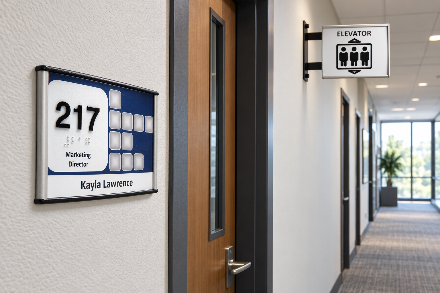
ADA Signs from Vista System
ADA Signs – Vista System

Procuring ADA signs for your office building is absolutely manageable when you break it into phases. Start with a comprehensive evaluation of your needs and understand the local sign codes.  Talk through the design and materials with a qualified manufacturer. Communicate frequently throughout installation and implement a strategy for ongoing maintenance.

The result is a wayfinding system that serves all building occupants while reflecting your professional standards. You’ll have the confidence that comes from knowing your building is equally compliant and welcoming. That’s a worthwhile investment in your property’s value and your occupants’ experience.