GreenSquare Flat Table Signs

GreenSquare just introduced their line of flat table signs to complement their curved counterpart.  Vista System International acquired the Australian company in the beginning of 2012 looking for a company that had the same modular construction as its MCFT (Modular Curved Frame Technology) line.  These interior signs were designed for a number of vertical applications, some of which are included below.Vista Table Signs
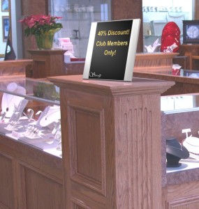
  • Retail – Table signs are used to highlight discounts and special promotions
  • Restaurants – These interior signs suggest daily lunch or dinner specials or perhaps new entrees.
  • Hotels – Table signs are used at the main counter listing various services or important information.  They are also used in hotel spas and workout facilities listing hours of operation, pricing information and club rules.
  • Office Buildings – Department information, phone or contact information are just two of the ways table signs are used.
  • Hospitals – Hospitals use a variety of interior signs including table signs.  Visitor instructions, emergency information, on-call numbers and staff schedules are just a few examples.

GreenSquare, like its MCFT counterpart, has a complete line of flat interior signs to complement their table signs.  The signs come in a wide variety of standard sizes to fit almost any application.  Due to their modular nature, it is quite simple to create custom signs should the project warrant that level of specificity.  They’re easy to install and even easier to maintain.  If you have desktop software and a local printer you can replace your inserts in minutes.  Simply put, GreenSquare makes interior signs simple! B7W76UZBSV6G

Vista System Flat Wall Signs by GreenSquare

Wall signs are typically used as wayfinding or directional signs.  In this, the first part of theVista Wall Signs series, I’d like to introduce the new GreenSquare wall frames and the pertinent information you need to know.

Wall signs increase visibility to your product or business.  They can be used as both interior or exterior signage as office signs or in the walkway or courtyard, respectively.  You might easily see wall signs in retail establishments, restaurants and airports hanging overhead, on posts or at the checkout counter.  Wall frames provide great POP (Point of Purchase) presence announcing a current sale, a future promotion or a new product that just hit the market.

Wall frames are also popular in schools, universities and office buildings.  Office signs with an employee or professor’s name and title are very common.  Office signs may also be used as directional signs, highlighting building or department locations or simply controlling traffic patterns.

Wall signs can be mounted on any vertical flat surface and come in numerous sizes and shapes.  The GreenSquare catalog lists many of the more common ones but you can customize your wall signs given the modularity of the product.  They’re all cut from larger extrusions so it is quite easy, and inexpensive, to have wall frames tailored to your office specifications.  In many cases it’s modularity allows you to match existing signage.

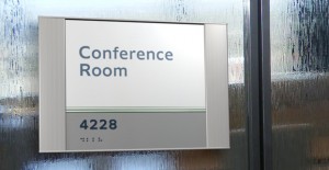
The flat wall signs by GreenSquare as depicted in the illustration are also aesthetically pleasing and crafted to complement even the most discriminating interior designs.


File Types and Sign Frame Inserts

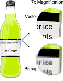
Sign Frame Vector Image IllustrationWhich file types would you use to create images for your sign frame inserts?  Vista signs make it easy to implement inserts into your office signs, but consider the following before making your decision.

File types will fall into two basic categories – vector and raster (or bit map) images.  The primary difference between them is that raster images are based on pixels and vector images are based on paths or strokes.  From a visceral standpoint, a vector image can be enlarged without distortion whereas bitmap images will distort the larger the image becomes.

Let’s say I’m installing a number of Vista sign frames in the building and my office signs consist of wall signs, table signs, directory signs and poster frames.  If I’m just going to put textual content on my directory signs for example I need not worry about a vector image here.  If I have a sign frame on my door with a picture of myself I may get by with a bit map image assuming the image resolution is high and the image size is reasonably small.

On the other hand, let’s say there are Vista signs in the break rooms and common areas with employee safety information consisting of full-color photo backgrounds and text.  In these cases I would highly recommend a vector image for maximum visibility.

If you’re not sure if a PDF, JPG or AI file is appropriate for your sign frame insert consult with your graphic designer or simply print it to size and make the determination yourself.


How to Effectively Maintain Your Signage Program

Signage is one of the last things companies or campuses will do upon moving into or remodeling their buildings.  For purposes of illustration, we’ll focus on wayfinding signs here but it could apply to any type of signage.

Let’s assume you’ve invested the time and energy into a uniform sign program and some modular approach for your wayfinding signs such as Vista signs.  Even if you’re successful in managing your signage program in-house what other factors must you consider?

  1. AttritionVista Signage Schedule Blueprint
  2. Sign Distributors
  3. Central Purchasing

Attrition at either your company or the sign company can cause the sign program to be compromised.  Graphics or templates get lost or discarded.  The wayfinding sign inserts must be re-created and the colors, fonts and calibration values of the machines must also be re-created too to mirror the existing signage.

There are numerous sign distributors throughout the country so if the material or product that you’re trying to source is not very common, it becomes a formidable challenge for your local sign company to procure.  Sign distributors also change their materials over time so it’s possible that even if you were able to find it you may discover that it’s not exactly what your originally installed.  Acrylic or faux metal inserts for wayfinding signs is just one example where this can occur.

Finally, set up a single point of contact when ordering your signage especially if you have distributed offices or are located in a campus environment.  Establishing a central purchasing entity will mitigate any downstream issues.

Three Basic Characteristics of a Successful Modular Sign System Implementation

Vista Architectural Signs GraphicWhat is it about a modular sign system that helps drive a successful enterprise-wide implementation of office signage? Simply defined, a modular sign system is a set of core components that can be assembled in different configurations with different options that when put together look like a custom sign system yet for a fraction of the price. There are numerous advantages, but with respect to architectural signage, it means a common, aesthetic look and feel throughout the company. The office signage is consistent from the directory signs, to the door signs to the desk signs and nameplates. The color schemes of the office signage complement the building decor.

So exactly what are the key characteristics of a sign system that enable a successful implementation?

  • Common Goal
  • Dedication
  • Implementation

First, you need to have a common goal when it comes to your architectural signage. Everyone must be on board from creative design services to facilities to upper management. It also implies a consistent message to the employees surrounding the goals of the new signs.

Dedication means that as a team you’re willing to work through the details surrounding your architectural signage. This includes the type of sign inserts or nameplates, color schemes and placement. For most small business implementations simply go with makes the most common sense. For larger implementations, your local sign contractor can provide guidance.

Lastly, just do it. Remember the goals that you set out initially for your sign system and make them happen. If you navigate the first two steps this step is actually the most fun and exciting.

Top 5 Reasons People Choose Vista Sign Frames

Having worked with Vista System sign frames over the last several years there are five primary reasons people choose Vista over the competition.

  • Quality – Vista System provides high quality sign frames at an affordable price.  These are not some cheap sign frames that will break down within the year or fail to withstand the elements.  Their product line is quite comprehensive and includes wall frames, desk name plates, directory signs, blade signs and others for both interior and exterior use.
  • Modularity – Vista sign frames come in a wide array of shapes and sizes.  This modular sign system is called the MCFT system by Vista which stands for Modular Curved Frame Technology.  Combined with the product line this modularity provides a common look and feel across your campus or business complex.
  • Cost – Although there’s always less expensive product out there, Vista System sign frames allow you to do the maintenance yourself without having to engage your local sign company to replace a name plate when someone gets promoted of leaves.  With paper inserts, the cost of maintenance is zero AND the time frame to get it replaced is solely dependent on how long it takes you to print out the new sign.
  • Aesthetics – With elegant brushed silver, black and gold finishes available they will significantly enhance the room decor.  Vista sign frames simply look great – enough said.
  • Support – Vista stands behind the products they sell and their customer support staff is in a league of their own.

Next time you’re in need of a modular sign system and quality sign frames choose Vista System – you’ll be glad you did.