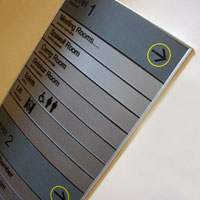
 An office directory sign is a great asset for any building or campus setting. Directory signs manage traffic flow and enhance the interior wall space. To ensure maximum flexibility and ease of maintenance in the future, take into account the following design considerations when putting together your office directory sign strategy.
- Volatility – How often do you anticipate the copy changing on your signage directory? If your tenants tend to turnover frequently you might consider using paper inserts for your office directory signs. You can print signage directory inserts cheaper and faster without having to engage your local sign company.
- Expandability – Office directory signs should be chosen with provision for future expandability. Having extra panels on your directory sign is the most simple and straightforward way to handle it. Rather than leaving blank panels on your directory sign, most manufacturers have sliding plastic dividers that allow you to modify the signage directory footprint with smaller panels in the event of unforeseen expansion.
- Consistency – Whether you use a curved signage directory like the D1U or flat directory signs like the DF41U, you must ensure the panels are consistent. If you do the paper inserts yourself save a copy of the template. If you use a local sign company ask for the font type, size and panel colors. Attrition and other factors may inhibit the sign company from keeping proper records of your signage standards.
Consider these factors when planning your office directory strategy and save tons of time and money.
